Axelit Laravel
Thank you so much for purchasing Axelit from themeforest.
- Version: 1.0
- Author: la-themes
- Created: 18 Jan 2025
- Update: 18 Jan 2025
If you have any questions that are beyond the scope of this help file, Please feel free to email via Item Support Page.
Installation
Follow the steps below to set up your site template:
- Unzip the downloaded package and open the /Axelit-laravel folder to find all the template files. You will need to upload these files to your hosting web server using FTP or localhost in order to use it on your website.
-
Below is the folder structure and needs to be uploaded to your website or localhost root directory
Axelit-laravel/resources/view- Contains all of the pages referencedAxelit-laravel/public/assets/css- Stylesheet filesAxelit-laravel/public/assets/images- Images filesAxelit-laravel/public/assets/js- Javascript filesAxelit-laravel/public/assets/sass- Sass filesAxelit-laravel/public/assets/vendor– All external libs.
Axelit-laravel/resources/view/index.blade.php- Homepage
- first of all go to
"https://getcomposer.org/download/"and then download composer - second npm install
- For start project use php artisan serve
- You should upload all or specific
.blade.phpfiles as per your need. - You are good to go for adding your content now!
-
If you want to compile scss through vite,
- - use npm run dev
- - use npm run build
Laravel Folder Structure
- Axelit-laravel
- public
- assets
- css
- responsive.css
- style.css
- fonts
- icons
- images
- js
- apexchart
- Calender
- emoji-picker
- map
- photoswipe
- simpale-datatable
- swiper-slider
- add_product.js
- advance_table.js
- alert.js
- analytics_dashboard.js
- scss
- app
- responsive.scss
- style.scss
- vendor
- resources
- views
- layout
- css.blade.php
- footer.blade.php
- header.blade.php
- master.blade.php
- script.blade.php
- sidebar.blade.php
- index.blade.php
- project_dashboard.blade.php
- crypto_dashboard.blade.php
- education_dashboard.blade.php
- calendar.blade.php
- wrapper.blade.php
- vite.config.js
Laravel Structure
Axelit follows a simple and easy to customize coding structure.
master.blade.php
<!DOCTYPE html>
<html lang="en">


    <!-- All meta and title start-->
    @include('layout.head')

    <!-- css start-->
    @include('layout.css')


  <body>
       <div class="app-wrapper">

               <!-- app loader -->
               <div class="loader-wrapper">
                   <div class="loader_16"></div>
               </div>

               <!-- Sidebar start-->
               @include('layout.sidebar')


               <div class="app-content">

                    <!-- header -->
                    @include('layout.header')

                    <!-- main section -->
                    <main>
                    @yield('main-content')
                    </main>
               </div>

               <!-- tap on top -->
                     <div class="go-top">
                       <span class="progress-value"> <i class="ti ti-arrow-up"></i> </span>
                     </div>

                <!-- Footer start -->
                @include('layout.footer')

        </div>

       <!--customizer-->
       <div id="customizer"></div>
  </body>

  <!-- Javascript -->
  @include('layout.script')

</html>
index.blade.php
@extends('layout.master')

@section('css')
      !-- add your custom css files --
@endsection

@section('main-content')
      !-- add your content --
@endsection
@section('script')
      !-- add your custom script files --
@endsection
SCSS
We have added SASS .scss files in template. If you know how to use SASS you
can
change sass files and compile the css as well. You can find sass file here -
Axelit/assets/sass/app
If you want to add new scss file. so you can_stylesheet.scss file in app
folder
and import file in style.scss and use easily
Open the sass/app/_variables.scss and Edit the values according to your
needs. If
you need more Advanced Setup then you can Edit the Respective Files yourself which have
been
branched inside the same Folder. It is completely at your discretion only to include the
Required .scss Files you need to minimize the amount of CSS & including only the Styles of
the
Blocks you need. This can be setup in your style.scss File.
Colors Variables
All color-related SCSS variables can be found in the
Axelit/asset/scss/app/_variables.scss
    .default{
   --primary: 140, 118, 240;
    --secondary: 100, 100, 100;
    }

    .gold {
        --primary: 192,127,0;
        --secondary: 76,61,61;
      }
Logo Settings
The Logo Container can be found in the Header Container - <header>
    <!-- Logo -->
    <div class="app-logo">
    <a class="logo d-inline-block" href="https://phpstack-426242-2145512.cloudwaysapps.com/Documents/Laravel/Axelit/" title="iDocs">
     <img src="{{asset('assets/images/logo/1.png')}}"> alt="Logo"/>
    </a>
    </div>
    <!-- Logo End -->
Provided Features
Layout
Documentation and examples for header, navbar, sidebar, footer
Ltr Layout
For enabling the Ltr Layout on your website, simply apply the ltrclass to the body tag and add the dir="ltr" attribute to your HTML tag

                                      <html lang="en" dir="ltr">
                                        <body class="ltr">

                                        </body>
                                      </html>
Rtl Layout
For enabling the Rtl Layout on your website, simply apply the rtlclass to the body tag and add the dir="rtl" attribute to your HTML tag
                                  <html lang="en" dir="rtl">
                                    <body class="rtl">

                                    </body>
                                   </html>
Box Layout
For enabling the Box Layout on your website, simply apply the box
class to the
body tag
                                  <html lang="en">
                                    <body class="box-layout">

                                    </body>
                                   </html>
Header
Documentation and examples for header

    <!-- Header Section starts -->

    <header class="header-main">
      <div class="container-fluid">
        <div class="row">
          <div class="col-12">
            <div class="card">
              <div class="card-body">
                <div class="row">
                  <div class="col-6 d-flex align-items-center header-left">
                    <span class="header-toggle me-2">
                      <i class="ti ti-category"> </i>
                    </span>

                    <div class="header-searchbar">

                    </div>
                  </div>
                  <div class="col-6 d-flex align-items-center justify-content-end header-right">
                    <ul class="d-flex align-items-center">

                      <li class="header-language">

                       </li>

                      <li class="header-apps">

                      </li>

                      <li class="header-cart d-none d-sm-block">

                      </li>

                      <li class="header-dark head-icon">

                      </li>

                      <li class="header-notification">

                      </li>

                      <li class="header-profile">

                      </li>
                    </ul>
                  </div>
                </div>
              </div>
            </div>
          </div>
        </div>
      </div>
    </header>

    <!-- Header Section ends -->
Sidebar
Documentation and examples for Sidebar
Vertical Sidebar
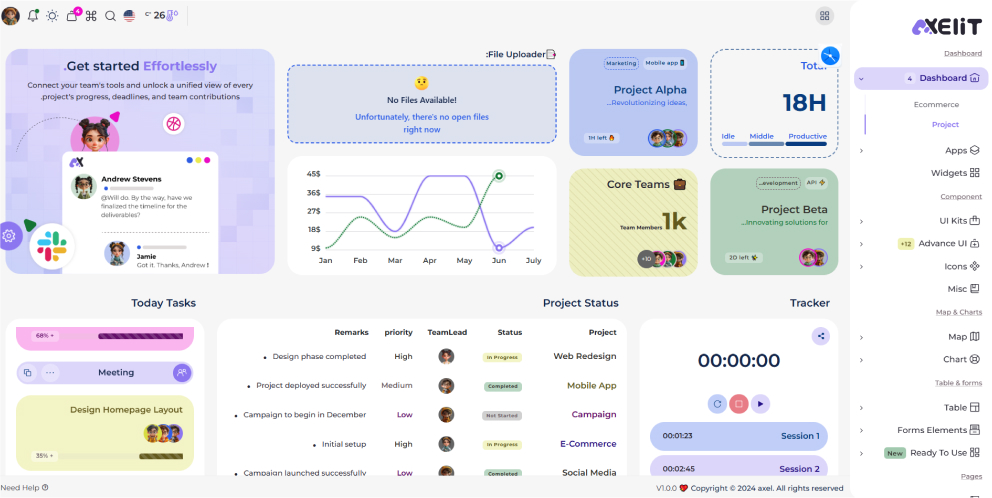
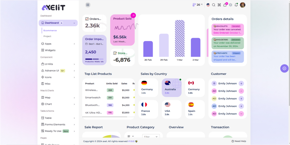
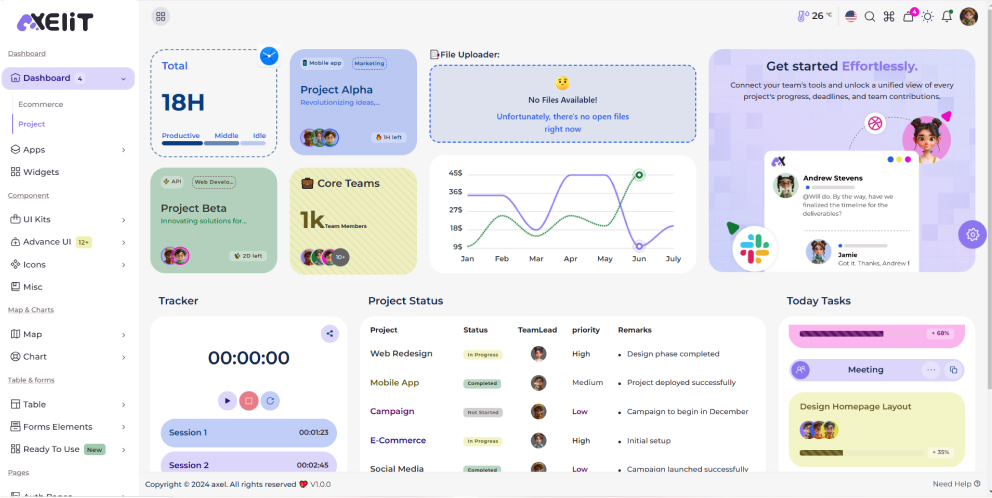
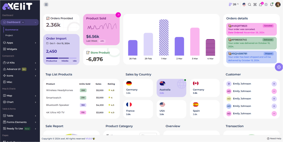
Vertical Sidebar See below image and code for more information.
    <nav class="vertical-sidebar">

    </nav>
Dark Sidebar
Dark background Color & Light text for dark sidebar. See below image and code for more information.
      <nav class="dark-sidebar">

      </nav>
Horizontal Sidebar
Horizontal Sidebar See below image and code for more information.
      <nav class="horizontal-sidebar">

      </nav>
Footer
The list of various footer types & its descriptions are provided below for your reference:

    <!-- Footer Section starts-->
    <footer>
    <div class="container-fluid">
      <div class="row">
        <div class="col-md-9 col-12">
          <ul class="footer-text">
            <li>
              <p class="mb-0">Copyright © 2023 Axelit. All rights reserved.</p>
            </li>
            <li> <a href="#"> V1.0.0 </a></li>
          </ul>
        </div>
        <div class="col-md-3">
          <ul class="footer-text text-end">
            <li> <a href="https://phpstack-426242-2145512.cloudwaysapps.com/Documents/Laravel/Axelit/"> Need Help <i class="ti ti-help"></i></a></li>
          </ul>
        </div>
      </div>
    </div>
    </footer>
    <!-- Footer Section ends-->
Apps
The list of Apps descriptions are provided below for your reference:
- Calender
- Profile
- Setting
- projects
- projects Details
- To-Do
- Team
- API
- Ticket
- Ticket Details
- Read Email
- Cart
- Product
- Add Product
- Product-Details
- Product list
- Orders
- Orders Details
- Orders List
- Check out
- Wishlist
- Invoice
- Chat
- File manager
- Bookmark
- Kanban board
- Timeline
- FAQS
- Pricing
- Gallery
- Blog
- Blog Details
- Add Blog
Helper Class
We have created some really useful helper classes for you.
Headings
PreviewAll heading Classes from <h1> to <h6> ,
are
at your disposal for structuring your content.
<div class="h1">  </div>
<div class="h2">  </div>
<div class="h3">  </div>
<div class="h4">  </div>
<div class="h5">  </div>
<div class="h6">  </div>
Font Size
PreviewChange the text size using .f-s- class.
<span class="f-s-10 "> </span>
<span class="f-s-12 "> </span>
<span class="f-s-14 "> </span>
<span class="f-s-16 "> </span>
<span class="f-s-18 "> </span>
<span class="f-s-20 "> </span>
<span class="f-s-24 "> </span>
<span class="f-s-32 "> </span>
Font Weight
PreviewChange the Font Weight using .f-fw- class.
      <span class="f-fw-100 ms-2"> </span>
      <span class="f-fw-200 ms-2"> </span>
      <span class="f-fw-300 ms-2"> </span>
      <span class="f-fw-400 ms-2"> </span>
      <span class="f-fw-500 ms-2"> </span>
      <span class="f-fw-600 ms-2"> </span>
      <span class="f-fw-700 ms-2"> </span>
      <span class="f-fw-800 ms-2"> </span>
      <span class="f-fw-900 ms-2"></span>
Text Color
PreviewChange the text Color using .text- class.
        <span class="text-primary">  </span>
        <span class="text-secondary">  </span>
        <span class="text-success">  </span>
        <span class="text-danger">  </span>
        <span class="text-warning">  </span>
        <span class="text-info">  </span>
        <span class="text-light">  </span>
        <span class="text-dark  ">  </span>
Text background Color
Change the text background Color using .txt-bg- class.
        <span class="txt-bg-primary">  </span>
        <span class="txt-bg-secondary">  </span>
        <span class="txt-bg-success">  </span>
        <span class="txt-bg-danger">  </span>
        <span class="txt-bg-warning">  </span>
        <span class="txt-bg-info">  </span>
        <span class="txt-bg-light">  </span>
        <span class="txt-bg-dark  ">  </span>
Text Align & Decoration
Change the text align & decoration .text- class.
        <div class="text-lowercase p-2"></div>
        <div class="text-uppercase p-2"></div>
        <div class="text-capitalize p-2"></div>
        <div class="text-center"></div>
        <div class="text-start"></div>
        <div class="text-end"></div>
        <span class="text-d-underline">  </span>
        <span class="text-d-line-through">  </span>
        <span class="text-d-overline"> </span>
        <span class="text-d-overline-underline"></span>
        <span class="text-d-line-underline"></span>
Ui Kits
Elevate Your Admin Experience with our Cutting-Edge UI Kits
Badges
    <span class="badge text-bg-primary"></span>
    <span class="badge text-bg-secondary"></span>
    <span class="badge text-bg-success"></span>
    <span class="badge text-bg-danger"></span>
    <span class="badge text-bg-warning"></span>
    <span class="badge text-bg-info"></span>
    <span class="badge text-bg-light"></span>
    <span class="badge text-bg-dark"></span>
Accordions
.accordion-body, though the transition does limit overflow.
.accordion-body, though the transition does limit overflow.
.accordion-body, though the transition does limit overflow.
    <div class="accordion app-accordion accordion-secondary">
    <div class="accordion-item">
    <h2 class="accordion-header">
    <button class="accordion-button" type="button" data-bs-toggle="collapse"
    data-bs-target="#collapseOne" aria-expanded="true" aria-controls="collapseOne">

    </button>
    </h2>
    <div id="collapseOne" class="accordion-collapse collapse show"
    data-bs-parent="#accordionExample">
    <div class="accordion-body">
        </div>
    </div>
    </div>
    <div class="accordion-item">
    <h2 class="accordion-header">
    <button class="accordion-button collapsed" type="button" data-bs-toggle="collapse"
    data-bs-target="#collapseTwo" aria-expanded="false" aria-controls="collapseTwo">

    </button>
    </h2>
    <div id="collapseTwo" class="accordion-collapse collapse" data-bs-parent="#accordionExample">
    <div class="accordion-body">

    </div>
    </div>
    </div>
    <div class="accordion-item">
    <h2 class="accordion-header">
    <button class="accordion-button collapsed" type="button" data-bs-toggle="collapse"
    data-bs-target="#collapseThree" aria-expanded="false" aria-controls="collapseThree">

    </button>
    </h2>
    <div id="collapseThree" class="accordion-collapse collapse" data-bs-parent="#accordionExample">
    <div class="accordion-body">

    </div>
    </div>
    </div>
    </div>
Alert
    <div class="alert alert-primary" role="alert">   </div>
    <div class="alert alert-secondary " role="alert">   </div>
    <div class="alert alert-success " role="alert">  </div>
    <div class="alert alert-danger " role="alert">   </div>
    <div class="alert alert-warning " role="alert">   </div>
    <div class="alert alert-info " role="alert">   </div>
    <div class="alert alert-light " role="alert">  </div>
    <div class="alert alert-dark " role="alert">   </div>
Progress
    <div class="progress w-100" role="progressbar" aria-valuenow="0" aria-valuemin="0"
    aria-valuemax="100">
    <div class="progress-bar bg-primary" style="width: 12.5%"></div>
    </div>
    <div class="progress w-100" role="progressbar" aria-valuenow="25" aria-valuemin="0"
    aria-valuemax="100">
    <div class="progress-bar bg-secondary" style="width: 25%"></div>
    </div>
    <div class="progress w-100" role="progressbar" aria-valuenow="37.5" aria-valuemin="0"
    aria-valuemax="100">
    <div class="progress-bar bg-success" style="width: 37.5%"></div>
    </div>
    <div class="progress w-100" role="progressbar" aria-valuenow="50" aria-valuemin="0"
    aria-valuemax="100">
    <div class="progress-bar bg-danger" style="width: 50%"></div>
    </div>
    <div class="progress w-100" role="progressbar" aria-valuenow="62.5" aria-valuemin="0"
    aria-valuemax="100">
    <div class="progress-bar bg-warning" style="width: 62.5%"></div>
    </div>
    <div class="progress w-100" role="progressbar" aria-valuenow="75" aria-valuemin="0"
    aria-valuemax="100">
    <div class="progress-bar bg-info" style="width: 75%"></div>
    </div>
    <div class="progress w-100" role="progressbar" aria-valuenow="82.5" aria-valuemin="0"
    aria-valuemax="100">
    <div class="progress-bar bg-light" style="width: 82.5%"></div>
    </div>
    <div class="progress w-100" role="progressbar" aria-valuenow="95" aria-valuemin="0"
    aria-valuemax="100">
    <div class="progress-bar bg-dark" style="width: 95%"></div>
    </div>
Advance Ui
Elevate Your Admin Interface with Advanced UI - Where Innovation Meets Intuition.
When utilizing JavaScript, make sure to add the following style & script tags.
    <!-- shepherd css -->
    <link rel="stylesheet" type="text/css" href="{{asset('assets/vendor/shepherdjs/shepherd.css')}}">
    <!-- shepherdjs -->
    <script src="{{asset('assets/vendor/shepherdjs/shepherd.min.js')}}"></script>
    <!-- tour js -->
    <script src="{{asset('assets/js/tour.js')}}"></script>
Tables
Basic Table
Using the most basic table need to add .table class to table tag
| Id | Name | Position | Office | Status | Salary | Contact |
|---|---|---|---|---|---|---|
| 1 |

Tiger Nixon |
Architect | Edinburgh | active | $320,800 | +1 (025) 466-7506 |
| 2 |

Garrett |
Accountant | Tokyo | pending | $170,750 | +1 (790) 476-9505 |
| 3 |

Aston Cox |
Technical | Francisco | pending | $86,000 | +1 (227) 375-6641 |
| 4 |

Cedric Kelly |
Developer | Edinburgh | active | $433,060 | +1 (213) 619-7749 |
| 5 |

Airi Satu |
Accountant | Tokyo | pending | $162,700 | +1 (152) 465-2290 |
| 6 |

Williamson x |
Integration | New York | active | $372,000 | +1 (185) 793-6446 |
<div class="table-responsive">
<table class="table mb-0">

</table>
</div>
DataTables has most features enabled by default, so all you need to do to use it
with
your own tables is to call the construction function:
$().DataTable();.
| Name | Position | Office | Age | Start date | Salary | Action |
|---|---|---|---|---|---|---|
| Tiger Nixon | System Architect | Edinburgh | 61 | $3674.55 | $320,800 | |
| Garrett Winters | Accountant | Tokyo | 63 | 2011-07-25 | $170,750 | |
| Aston Cox | Junior Technical Author | San Francisco | 66 | 2009-01-12 | $86,000 | |
| Cedric Kelly | Senior Javascript Developer | Edinburgh | 22 | 2012-03-29 | $433,060 |
- When utilizing JavaScript, make sure to add the following script tags.
<!-- Data Table css-->
<link rel="stylesheet" type="text/css" href="{{asset('assets/vendor/datatable/jquery.dataTables.min.css')}}">
<link rel="stylesheet" type="text/css" href="{{asset('assets/vendor/datatable/datatable2/buttons.dataTables.min.css')}}">


<!-- Data Table js-->
 <script src="{{asset('assets/vendor/datatable/jquery.dataTables.min.js')}}"></script>
 <script src="{{asset('assets/vendor/datatable/datatable2/dataTables.buttons.min.js')}}"></script>
 <script src="{{asset('assets/vendor/datatable/datatable2/jszip.min.js')}}"></script>
 <script src="{{asset('assets/vendor/datatable/datatable2/pdfmake.min.js')}}"></script>
 <script src="{{asset('assets/vendor/datatable/datatable2/vfs_fonts.js')}}"></script>
 <script src="{{asset('assets/vendor/datatable/datatable2/buttons.html5.min.js')}}"></script>
 <script src="{{asset('assets/vendor/datatable/datatable2/buttons.print.min.js')}}"></script>

 <!-- Data Table js-->
 <script src="{{asset('assets/js/data_table.js')}}"></script>
Forms
Tooltips Validation
If your form layout allows it, you can swap the SP
.{valid|invalid}-feedback classes for
.{valid|invalid}-tooltip classes to display validation feedback in a
styled tooltip.
<form class="row g-3 app-form" id="form-validation">
  <div class="col-md-6">
   <label for="userName" class="form-label">User Name</label>
   <input type="text" class="form-control" id="userName" name="userName">
   <div class="mt-1">
    <span id="userNameError" class="text-danger"></span>
   </div>
  </div>
  <div class="col-md-6">
   <label for="email" class="form-label">Email</label>
   <input type="email" class="form-control" id="email">
   <div class="mt-1">
    <span id="emailError" class="text-danger"></span>
   </div>
  </div>
  <div class="col-md-6">
   <label for="password" class="form-label">Password</label>
   <input type="password" class="form-control" id="password">
   <div class="mt-1">
    <span id="passwordError" class="text-danger"></span>
   </div>
  </div>
  <div class="col-6">
   <label for="address" class="form-label">Address</label>
   <input type="text" class="form-control" id="address" placeholder="1234 Main St">
   <div class="mt-1">
    <span id="addressError" class="text-danger"></span>
   </div>
  </div>
  <div class="col-5">
   <label for="address2" class="form-label">Address 2</label>
   <input type="text" class="form-control" id="address2" placeholder="Address">
  <div class="mt-1">
   <span id="addressError2" class="text-danger"></span>
  </div>
  </div>
  <div class="col-md-5">
   <label for="city" class="form-label">City</label>
   <input type="text" class="form-control" id="city">
   <div class="mt-1">
    <span id="cityError" class="text-danger"></span>
   </div>
  </div>
  <div class="col-md-2">
   <label for="zipCode" class="form-label">Zip</label>
   <input type="text" class="form-control" id="zipCode">
   <div class="mt-1">
    <span id="zipCodeError" class="text-danger"></span>
   </div>
  </div>
  <div class="col-12">
   <div class="form-check d-flex gap-1">
    <input class="form-check-input mg-2" type="checkbox" id="gridCheck">
    <label class="form-check-label" for="gridCheck">
     Check me out
    </label>
   </div>
  </div>
  <div class="col-12">
   <button type="submit" value="Submit" class="btn btn-primary">Submit form</button>
  </div>
 </form>
Default Vertical Form
<form class="app-form">
 <div class="mb-3">
  <label class="form-label">Email address</label>
  <input type="email" class="form-control">
  <div class="form-text">We'll never share your email with anyone else.</div>
 </div>
 <div class="mb-3">
  <label class="form-label">Password</label>
  <input type="password" class="form-control">
 </div>
 <div class="mb-3 form-check d-flex p-0">
  <input type="checkbox" class="m-1 form-check-input" id="formCheck1">
  <label class="form-check-label" for="formCheck1">remember me</label>
 </div>
 <div class="text-end">
  <button type="submit" class="btn btn-primary">Submit</button>
 </div>
</form>
Maps
- When utilizing JavaScript, make sure to add the following script tags.
<!-- google maps api-->
<script src="{{asset('http://maps.google.com/maps/api/js')}}"></script>

<!-- google maps js-->
<script src="{{asset('assets/vendor/googlemap/gmaps.js')}}"></script>

<!-- google maps custom js-->
<script src="{{asset('assets/js/google-map.js')}}"></script>
- When utilizing JavaScript, make sure to add the following script tags.
<!-- leaflet css-->
<link src="{{asset('assets/vendor/leafletmaps/leaflet.css')}}"></link>

<!-- leaflet map js-->
<script src="{{asset('assets/vendor/leafletmaps/leaflet.js')}}"></script>

<!-- leaflet map custom js-->
<script src="{{asset('assets/js/leaflet-map.js')}}"></script>
- When utilizing JavaScript, make sure to add the following script tags.
<!-- vector Map css-->
<link src="{{asset('assets/vendor/vector-map/jquery-jvectormap.css')}}"></link>

<!-- leaflet map js-->
<script src="{{asset('assets/vendor/vector-map/jquery-jvectormap-2.0.5.min.js')}}"></script>
<script src="{{asset('assets/vendor/vector-map/jquery-jvectormap-world-mill.js')}}"></script>
<script src="{{asset('assets/vendor/vector-map/europe-mill.js')}}"></script>
<script src="{{asset('assets/vendor/vector-map/jquery-jvectormap-us-lcc.js')}}"></script>
<script src="{{asset('assets/vendor/vector-map/jvectormap-es-mill.js')}}"></script>
<script src="{{asset('assets/vendor/vector-map/africa-mill.js')}}"></script>
<script src="{{asset('assets/vendor/vector-map/asia-mill.js')}}"></script>
<script src="{{asset('assets/vendor/vector-map/uk_countries-mill.js')}}"></script>
<script src="{{asset('assets/vendor/vector-map/ru-mill.js')}}"></script>

<!-- leaflet map custom js-->
<script src="{{asset('assets/js/vector-map.js')}}"></script>
Chart
- When utilizing JavaScript, make sure to add the following script tags.
<!-- apexchart css-->
<link rel="stylesheet" type="text/css" href="{{asset('assets/vendor/apexcharts/apexcharts.css')}}">

<!-- apexchart js-->
<script src="{{asset('assets/vendor/apexcharts/apexcharts.min.js')}}"></script>
Icons
- Icons Fontawesome - https://fontawesome.com/
- Icons Flag - https://alexsobolenko.github.io/flag-icons/
- Icons Tabler - https://tabler-icons.io//
- Icons Wheather - http://erikflowers.github.io/weather-icons/
Scripts
- listJs - https://listjs.com/
- masonry - https://masonry.desandro.com/
- notifications - https://apvarun.github.io/toastify-js/
- nouislider - https://refreshless.com/nouislider/
- select - https://select2.org/
- simplebar - https://grsmto.github.io/simplebar/
- slick - https://kenwheeler.github.io/slick/
- stacks - https://draggabilly.desandro.com/
- sweetalert - https://sweetalert2.github.io/
- tourguide-js - https://shepherdjs.dev/docs/index.html
- trumbowyg - https://alex-d.github.io/Trumbowyg/documentation/
- typeahead - https://twitter.github.io/typeahead.js/
- vector-map - https://jvectormap.com/
- animation - https://animate.style/
- apexcharts - https://apexcharts.com/
- bootstrap - https://getbootstrap.com/
- chats.js - https://www.chartjs.org/
- cleavejs - https://nosir.github.io/cleave.js/
- datatable - https://datatables.net/
- datepikar - https://flatpickr.js.org/
- dual listboxes - https://bulma.io/
- filepond - https://pqina.nl/filepond/
- FullCalendar - https://fullcalendar.io/docs/initialize-globals
- glightbox - https://biati-digital.github.io/glightbox/
- googlemap - https://hpneo.dev/gmaps/
- introjs - https://introjs.com/
- kanban_board - https://muuri.dev/
- leafletmaps - https://leafletjs.com/index.html
Changelog
See what's new added, changed, fixed, improved or updated in the latest versions.
Version 1.0 (18 Jan 2025)
Initial Release