Bango's Documentation

Introduction

Thank you for purchasing this product. If you have any questions that are beyond the scope of this documentation, please feel free to contact us.

  • Item Name : Bengo - Multipurpose Ecommerce HTML Template
  • Authore : Unicoder
  • Type : HTML Template
  • Created: August 30, 2021
  • Version 1.0.1
  • By: Unicoder
  • Email: unicoder16@gmail.com

Template Features

  • Multi Page Demos
  • Easy to customize
  • HTML5 & CSS3
  • Clean & Simple Design
  • Fully Responsive Layout
  • Crossbrowser Compatible with Edge, IE10+, Firefox, Safari, Opera, Chrome
  • Premium Layer Slider
  • W3 Valided
  • Retina ready
  • Font Awesome 400+ icons
  • Flat icons uses
  • Powered with Bootstrap 5 Beta
  • Pixel Perfect Responsive
  • Smooth animation
  • Google Maps easy to setup via data attributes
  • Awesome product thumbnail design
  • Well documented

Started Template

The following included files and structure the template start. It's the basic format of the template and included source.

<!DOCTYPE html>
<html lang="en">
<head>
	<!-- Meta Tag -->
	<meta charset="utf-8">
	<meta http-equiv="X-UA-Compatible" content="IE=edge">
	<meta name="viewport" content="width=device-width, initial-scale=1">
	<meta name="description" content="Bengo - Multipurpose Ecommerce HTML Template">

	<meta name="author" content="root">
	<title>Bengo - Multipurpose Ecommerce HTML Template</title>

	<!-- Favicon -->
	<link rel="shortcut icon" href="assets/images/favicon.png">

	<!-- Google Font -->
    <link href="https://fonts.googleapis.com/css2?family=Roboto:wght@100;300;400;500;700;900&display=swap" rel="stylesheet">
    <link href="https://fonts.googleapis.com/css2?family=Poppins:wght@100;200;300;400;500;600;700;800;900&display=swap" rel="stylesheet">

	<!--  CSS Style -->
    <link rel="stylesheet" href="assets/css/bootstrap.min.css">
    <link rel="stylesheet" href="assets/css/layerslider.css">
    <link rel="stylesheet" href="assets/css/all.min.css">
    <link rel="stylesheet" href="assets/webfonts/icofont/icofont.min.css">
    <link rel="stylesheet" href="assets/webfonts/flaticon/flaticon.css">
    <link rel="stylesheet" href="assets/css/animate.min.css">
    <link rel="stylesheet" href="assets/css/owl.carousel.min.css">
    <link rel="stylesheet" href="assets/css/jquery.fancybox.min.css">
    <link rel="stylesheet" href="assets/css/template.css">
    <link rel="stylesheet" href="assets/css/style.css">
    <link rel="stylesheet" href="assets/css/category/default.css">
</head>
<body class="push-body">

    <!-- All Javascript Plugin File here -->
    <script src="assets/js/jquery-2.1.3.min.js"></script>
    <script src="assets/js/greensock.js"></script>
    <script src="assets/js/layerslider.transitions.js"></script>
    <script src="assets/js/layerslider.kreaturamedia.jquery.js"></script>
    <script src="assets/js/bootstrap.bundle.min.js"></script>
    <script src="assets/js/owl.carousel.min.js"></script>
    <script src="assets/js/jquery.fancybox.min.js"></script>
    <script src="assets/js/jquery.countdown.js"></script>
    <script src="assets/js/custom.js"></script>

</body>
</html>

Installation

Thank you for purchasing this product. Follow the steps below to setup your site template:

  • Unzip the downloaded package and open the /HTML folder to find all the template files. You will need to upload these files to your hosting web server using FTP in order to use it on your website.
  • Below is the folder structure and needs to be uploaded to your website root directory:
    • template/assets/css - Stylesheet files
    • template/assets/images - Images files
    • template/assets/js - Javascript files
    • template/assets/skins - Slider elements
    • template/assets/webfonts - Icon fonts
  • You should upload all or specific HTML files as per your need.
  • You're now good to go..! Start adding your content/images and generate your beautiful brand new website for your awesome users.

HTML Stracture

Bengo follows a simple and easy to customize coding structure. Here is the sample for your reference:

<!doctype html>
<html class="no-js" lang="en">
    <head>
        <!-- title -->
        <meta charset="utf-8">
        <!-- description -->
        <meta name="description" content="">
        <!-- keywords -->
        <meta name="keywords" content="">
        <!-- favicon -->
        <!-- style -->
    </head>
    <body>
        <!-- start header -->
        <header>
            <!-- start navigation -->
            <nav class="navbar navbar-default bootsnav navbar-expand-lg">
                ...
            </nav>
            <!-- end navigation -->
        </header>
        <!-- end header -->
        <!-- start sections -->
        <section>
            ...
        </section>
        <!-- end sections -->
        <!-- start footer --> 
        <footer>
            <div class="container">
                ...
            </div>
        </footer>
        <!-- end footer -->
        <!-- javascript libraries -->
    </body>
</html>


Third Party Credits

We are extremely grateful for the people working on the projects below. These guys are making our lives much easier, thus we can focus on building high quality products.

Project Homepage Comment
jQuery jquery.com The most popular JavaScript library for building complex web apps.
GreenSock greensock.com The most advanced web animation library to build spectacular transitions.
Mixitup kunkalabs.com The most popular jQuery tab and filter plugin.
Fancybox fancybox.net The most popular jQuery popup and photo gallery plugin.
WOW wowjs.uk Wow js work as animation of loading content.
LayerSlider layerslider.kreaturamedia.com Layer Slider use as template slider and create some custom slider.

Page Title

You can choose page titles while creating your pages. The list of page title options & its descriptions are provided below for your reference:

1. Simple Page Title

<!-- start page banner -->					
<div class="full-row bg-light py-5">
	<div class="container">
		<div class="row text-secondary">
			<div class="col-sm-6">
				<h3 class="mb-2 text-secondary">Shop Grid</h3>
			</div>
			<div class="col-sm-6">
				<nav aria-label="breadcrumb" class="d-flex justify-content-sm-end align-items-center h-100">
					<ol class="breadcrumb mb-0 d-inline-flex bg-transparent p-0">
						<li class="breadcrumb-item"><a href="index.html"><i class="fas fa-home me-1"></i>Home</a></li>
						<li class="breadcrumb-item active" aria-current="page">Shop Grid</li>
					</ol>
				</nav>
			</div>
		</div>
	</div>
</div>
<!-- end page banner -->

2. Page Title White Left

<!-- breadcrumb Start -->
<div class="full-row pb-0" style="background: url("assets/images/background/14.png") 0px 0px / cover no-repeat; padding-top: 152px;">
	<div class="container">
		<div class="row justify-content-center">
			<div class="col-lg-7">
				<div class="page-banner text-white text-center py-8">
					<h1 class="text-white">About Us</h1>
					<p>Lorem ipsum dolor sit amet, consectetur adipiscing elit, sed do eiusmod tempor incididunt ut labore et dolore magna aliqua. Quis ipsum suspendisse ultrices gravida. Risus commodo viverra maecenas.</p>
				</div>
			</div>
		</div>
	</div>
</div>
<!-- breadcrumb End -->

3. Page Title Background

<!-- breadcrumb Start -->
<div class="full-row pb-0 max-md-pt-0" style="background: url("assets/images/background/15.png") 0px 0px / cover no-repeat; padding-top: 152px;">
	<div class="container">
		<div class="row justify-content-center">
			<div class="col-lg-7">
				<nav aria-label="breadcrumb" class="breadcrumb-2 d-flex justify-content-center align-items-center h-100 max-md-py-100" style="padding: 100px 0 300px;">
					<ol class="breadcrumb mb-0 align-items-center">
						<li class="breadcrumb-item"><a href="index.html"><i class="fas fa-home me-1"></i>Home</a></li>
						<li class="breadcrumb-item active" aria-current="page">Blog</li>
					</ol>
				</nav>
			</div>
		</div>
	</div>
</div>
<!-- breadcrumb End -->

Column and Grid

Basic grid layouts to get you familiar with building within the Bootstrap grid system. we migrate entire theme in Bootstrap 4, so you can find detaild documentation on grid here https://getbootstrap.com/docs/4.3/layout/grid/

Three equal columns

Get three equal-width columns starting at desktops and scaling to large desktops. On mobile devices, tablets and below, the columns will automatically stack.

One of three columns
<div class="container">
  <div class="row">
    <div class="col-sm">
      One of three columns
    </div>
    <div class="col-sm">
      One of three columns
    </div>
    <div class="col-sm">
      One of three columns
    </div>
  </div>
</div>                                                
                                            

The above example creates three equal-width columns on small, medium, large, and extra large devices using our predefined grid classes. Those columns are centered in the page with the parent .container.

Grid options

See how aspects of the Bootstrap grid system work across multiple devices with a handy table.

Extra small
<576px
Small
≥576px
Medium
≥768px
Large
≥992px
Extra large
≥1200px
Max container width None (auto) 540px 720px 960px 1140px
Class prefix .col- .col-sm- .col-md- .col-lg- .col-xl-
# of columns 12
Gutter width 30px (15px on each side of a column)
Nestable Yes
Column ordering Yes

Auto-layout columns

Utilize breakpoint-specific column classes for easy column sizing without an explicit numbered class like .col-sm-6.

Equal-width

For example, here are two grid layouts that apply to every device and viewport, from xs to xl. Add any number of unit-less classes for each breakpoint you need and every column will be the same width.

1 of 2
2 of 2
1 of 3
2 of 3
3 of 3
<div class="container">
  <div class="row">
    <div class="col">
      1 of 2
    </div>
    <div class="col">
      2 of 2
    </div>
  </div>
  <div class="row">
    <div class="col">
      1 of 3
    </div>
    <div class="col">
      2 of 3
    </div>
    <div class="col">
      3 of 3
    </div>
  </div>
</div>                                                
                                            

Equal-width columns can be broken into multiple lines, but there was a Safari flexbox bug that prevented this from working without an explicit flex-basis or border. There are workarounds for older browser versions, but they shouldn’t be necessary if you’re up-to-date.

Column
Column
Column
Column
<div class="container">
  <div class="row">
    <div class="col">Column</div>
    <div class="col">Column</div>
    <div class="w-100"></div>
    <div class="col">Column</div>
    <div class="col">Column</div>
  </div>
</div>                                                
                                            

Setting one column width

Auto-layout for flexbox grid columns also means you can set the width of one column and have the sibling columns automatically resize around it. You may use predefined grid classes (as shown below), grid mixins, or inline widths. Note that the other columns will resize no matter the width of the center column.

1 of 3
2 of 3 (wider)
3 of 3
1 of 3
2 of 3 (wider)
3 of 3
<div class="container">
  <div class="row">
    <div class="col">
      1 of 3
    </div>
    <div class="col-6">
      2 of 3 (wider)
    </div>
    <div class="col">
      3 of 3
    </div>
  </div>
  <div class="row">
    <div class="col">
      1 of 3
    </div>
    <div class="col-8">
      2 of 3 (wider)
    </div>
    <div class="col">
      3 of 3
    </div>
  </div>
</div>                                                
                                            

Variable width content

Use col-{breakpoint}-auto classes to size columns based on the natural width of their content.

1 of 3
Variable width content
3 of 3
1 of 3
Variable width content
3 of 3
<div class="container">
  <div class="row justify-content-md-center">
    <div class="col col-lg-2">
      1 of 3
    </div>
    <div class="col-md-auto">
      Variable width content
    </div>
    <div class="col col-lg-2">
      3 of 3
    </div>
  </div>
  <div class="row">
    <div class="col">
      1 of 3
    </div>
    <div class="col-md-auto">
      Variable width content
    </div>
    <div class="col col-lg-2">
      3 of 3
    </div>
  </div>
</div>                                                
                                            

Responsive classes

Bootstrap’s grid includes five tiers of predefined classes for building complex responsive layouts. Customize the size of your columns on extra small, small, medium, large, or extra large devices however you see fit.

All breakpoints

For grids that are the same from the smallest of devices to the largest, use the .col and .col-* classes. Specify a numbered class when you need a particularly sized column; otherwise, feel free to stick to .col.

col
col
col
col
col-8
col-4
<div class="container">
  <div class="row">
    <div class="col">col</div>
    <div class="col">col</div>
    <div class="col">col</div>
    <div class="col">col</div>
  </div>
  <div class="row">
    <div class="col-8">col-8</div>
    <div class="col-4">col-4</div>
  </div>
</div>                                               
                                            

Stacked to horizontal

Using a single set of .col-sm-* classes, you can create a basic grid system that starts out stacked and becomes horizontal at the small breakpoint (sm).

col-sm-8
col-sm-4
col-sm
col-sm
col-sm
<div class="container">
  <div class="row">
    <div class="col-sm-8">col-sm-8</div>
    <div class="col-sm-4">col-sm-4</div>
  </div>
  <div class="row">
    <div class="col-sm">col-sm</div>
    <div class="col-sm">col-sm</div>
    <div class="col-sm">col-sm</div>
  </div>
</div>                                               
                                            

Mix and match

Don’t want your columns to simply stack in some grid tiers? Use a combination of different classes for each tier as needed. See the example below for a better idea of how it all works.

.col-12 .col-md-8
.col-6 .col-md-4
.col-6 .col-md-4
.col-6 .col-md-4
.col-6 .col-md-4
.col-6
.col-6
<div class="container">
  <!-- Stack the columns on mobile by making one full-width and the other half-width -->
  <div class="row">
    <div class="col-12 col-md-8">.col-12 .col-md-8</div>
    <div class="col-6 col-md-4">.col-6 .col-md-4</div>
  </div>

  <!-- Columns start at 50% wide on mobile and bump up to 33.3% wide on desktop -->
  <div class="row">
    <div class="col-6 col-md-4">.col-6 .col-md-4</div>
    <div class="col-6 col-md-4">.col-6 .col-md-4</div>
    <div class="col-6 col-md-4">.col-6 .col-md-4</div>
  </div>

  <!-- Columns are always 50% wide, on mobile and desktop -->
  <div class="row">
    <div class="col-6">.col-6</div>
    <div class="col-6">.col-6</div>
  </div>
</div>                                             
                                            

Gutters

Gutters can be responsively adjusted by breakpoint-specific padding and negative margin utility classes. To change the gutters in a given row, pair a negative margin utility on the .row and matching padding utilities on the .cols. The .container or .container-fluid parent may need to be adjusted too to avoid unwanted overflow, using again matching padding utility.

Here’s an example of customizing the Bootstrap grid at the large (lg) breakpoint and above. We’ve increased the .col padding with .px-lg-5, counteracted that with .mx-lg-n5 on the parent .row and then adjusted the .container wrapper with .px-lg-5.

Custom column padding
<div class="container px-lg-5">
  <div class="row mx-lg-n5">
    <div class="col py-3 px-lg-5 border bg-light">Custom column padding</div>
    <div class="col py-3 px-lg-5 border bg-light">Custom column padding</div>
  </div>
</div>                                            
                                            

Alignment

Use flexbox alignment utilities to vertically and horizontally align columns. Internet Explorer 10-11 do not support vertical alignment of flex items when the flex container has a min-height as shown below.

Vertical alignment

One of three columns
<div class="container">
  <div class="row align-items-start">
    <div class="col">
      One of three columns
    </div>
    <div class="col">
      One of three columns
    </div>
    <div class="col">
      One of three columns
    </div>
  </div>
  <div class="row align-items-center">
    <div class="col">
      One of three columns
    </div>
    <div class="col">
      One of three columns
    </div>
    <div class="col">
      One of three columns
    </div>
  </div>
  <div class="row align-items-end">
    <div class="col">
      One of three columns
    </div>
    <div class="col">
      One of three columns
    </div>
    <div class="col">
      One of three columns
    </div>
  </div>
</div>                                           
                                            
One of three columns
<div class="container">
  <div class="row">
    <div class="col align-self-start">
      One of three columns
    </div>
    <div class="col align-self-center">
      One of three columns
    </div>
    <div class="col align-self-end">
      One of three columns
    </div>
  </div>
</div>                                           
                                            

Horizontal alignment

One of two columns
One of two columns
One of two columns
One of two columns
One of two columns
One of two columns
One of two columns
One of two columns
One of two columns
One of two columns
<div class="container">
  <div class="row justify-content-start">
    <div class="col-4">
      One of two columns
    </div>
    <div class="col-4">
      One of two columns
    </div>
  </div>
  <div class="row justify-content-center">
    <div class="col-4">
      One of two columns
    </div>
    <div class="col-4">
      One of two columns
    </div>
  </div>
  <div class="row justify-content-end">
    <div class="col-4">
      One of two columns
    </div>
    <div class="col-4">
      One of two columns
    </div>
  </div>
  <div class="row justify-content-around">
    <div class="col-4">
      One of two columns
    </div>
    <div class="col-4">
      One of two columns
    </div>
  </div>
  <div class="row justify-content-between">
    <div class="col-4">
      One of two columns
    </div>
    <div class="col-4">
      One of two columns
    </div>
  </div>
</div>                                        
                                            

No gutters

The gutters between columns in our predefined grid classes can be removed with .no-gutters. This removes the negative margins from .row and the horizontal padding from all immediate children columns.

Need an edge-to-edge design? Drop the parent .container or .container-fluid.

.no-gutters {
  margin-right: 0;
  margin-left: 0;

  > .col,
  > [class*="col-"] {
    padding-right: 0;
    padding-left: 0;
  }
}                                                
                                            

In practice, here’s how it looks. Note you can continue to use this with all other predefined grid classes (including column widths, responsive tiers, reorders, and more).

.col-12 .col-sm-6 .col-md-8
<div class="row no-gutters">
  <div class="col-12 col-sm-6 col-md-8">.col-12 .col-sm-6 .col-md-8</div>
  <div class="col-6 col-md-4">.col-6 .col-md-4</div>
</div>                                      
                                            

Column wrapping

If more than 12 columns are placed within a single row, each group of extra columns will, as one unit, wrap onto a new line.

.col-9
.col-4
Since 9 + 4 = 13 > 12, this 4-column-wide div gets wrapped onto a new line as one contiguous unit.
.col-6
Subsequent columns continue along the new line.
<div class="container">
  <div class="row">
    <div class="col-9">.col-9</div>
    <div class="col-4">.col-4<br>Since 9 + 4 = 13 > 12, this 4-column-wide div gets wrapped onto a new line as one contiguous unit.</div>
    <div class="col-6">.col-6<br>Subsequent columns continue along the new line.</div>
  </div>
</div>                                           
                                            

Column breaks

Breaking columns to a new line in flexbox requires a small hack: add an element with width: 100% wherever you want to wrap your columns to a new line. Normally this is accomplished with multiple .rows, but not every implementation method can account for this.

.col-6 .col-sm-3
.col-6 .col-sm-3
.col-6 .col-sm-3
.col-6 .col-sm-3
<div class="container">
  <div class="row">
    <div class="col-6 col-sm-3">.col-6 .col-sm-3</div>
    <div class="col-6 col-sm-3">.col-6 .col-sm-3</div>

    <!-- Force next columns to break to new line -->
    <div class="w-100"></div>

    <div class="col-6 col-sm-3">.col-6 .col-sm-3</div>
    <div class="col-6 col-sm-3">.col-6 .col-sm-3</div>
  </div>
</div>
                                            

Order classes

Use .order- classes for controlling the visual order of your content. These classes are responsive, so you can set the order by breakpoint (e.g., .order-1.order-md-2). Includes support for 1 through 12 across all five grid tiers.

First, but unordered
Third, but first
Second, but last
<div class="container">
  <div class="row">
    <div class="col">
      First, but unordered
    </div>
    <div class="col order-12">
      Second, but last
    </div>
    <div class="col order-1">
      Third, but first
    </div>
  </div>
</div>
                                            

Order classes

There are also responsive .order-first and .order-last classes that change the order of an element by applying order: -1 and order: 13 (order: $columns + 1), respectively. These classes can also be intermixed with the numbered .order-* classes as needed.

Third, but first
Second, but unordered
First, but last
<div class="container">
  <div class="row">
    <div class="col order-last">
      First, but last
    </div>
    <div class="col">
      Second, but unordered
    </div>
    <div class="col order-first">
      Third, but first
    </div>
  </div>
</div>
                                            

Offset classes

Move columns to the right using .offset-md-* classes. These classes increase the left margin of a column by * columns. For example, .offset-md-4 moves .col-md-4 over four columns.

.col-md-4
.col-md-4 .offset-md-4
.col-md-3 .offset-md-3
.col-md-6 .offset-md-3
<div class="container">
  <div class="row">
    <div class="col-md-4">.col-md-4</div>
    <div class="col-md-4 offset-md-4">.col-md-4 .offset-md-4</div>
  </div>
  <div class="row">
    <div class="col-md-3 offset-md-3">.col-md-3 .offset-md-3</div>
    <div class="col-md-3 offset-md-3">.col-md-3 .offset-md-3</div>
  </div>
  <div class="row">
    <div class="col-md-6 offset-md-3">.col-md-6 .offset-md-3</div>
  </div>
</div>
                                            

Margin utilities

With the move to flexbox in v4, you can use margin utilities like .mr-auto to force sibling columns away from one another.

.col-md-4
.col-md-4 .ml-auto
.col-md-3 .ml-md-auto
.col-auto .mr-auto
.col-auto
<div class="container">
  <div class="row">
    <div class="col-md-4">.col-md-4</div>
    <div class="col-md-4 ml-auto">.col-md-4 .ml-auto</div>
  </div>
  <div class="row">
    <div class="col-md-3 ml-md-auto">.col-md-3 .ml-md-auto</div>
    <div class="col-md-3 ml-md-auto">.col-md-3 .ml-md-auto</div>
  </div>
  <div class="row">
    <div class="col-auto mr-auto">.col-auto .mr-auto</div>
    <div class="col-auto">.col-auto</div>
  </div>
</div>
                                            

Nesting

To nest your content with the default grid, add a new .row and set of .col-sm-* columns within an existing .col-sm-* column. Nested rows should include a set of columns that add up to 12 or fewer (it is not required that you use all 12 available columns).

Level 1: .col-sm-9
Level 2: .col-8 .col-sm-6
Level 2: .col-4 .col-sm-6
<div class="container">
  <div class="row">
    <div class="col-sm-9">
      Level 1: .col-sm-9
      <div class="row">
        <div class="col-8 col-sm-6">
          Level 2: .col-8 .col-sm-6
        </div>
        <div class="col-4 col-sm-6">
          Level 2: .col-4 .col-sm-6
        </div>
      </div>
    </div>
  </div>
</div>
                                            

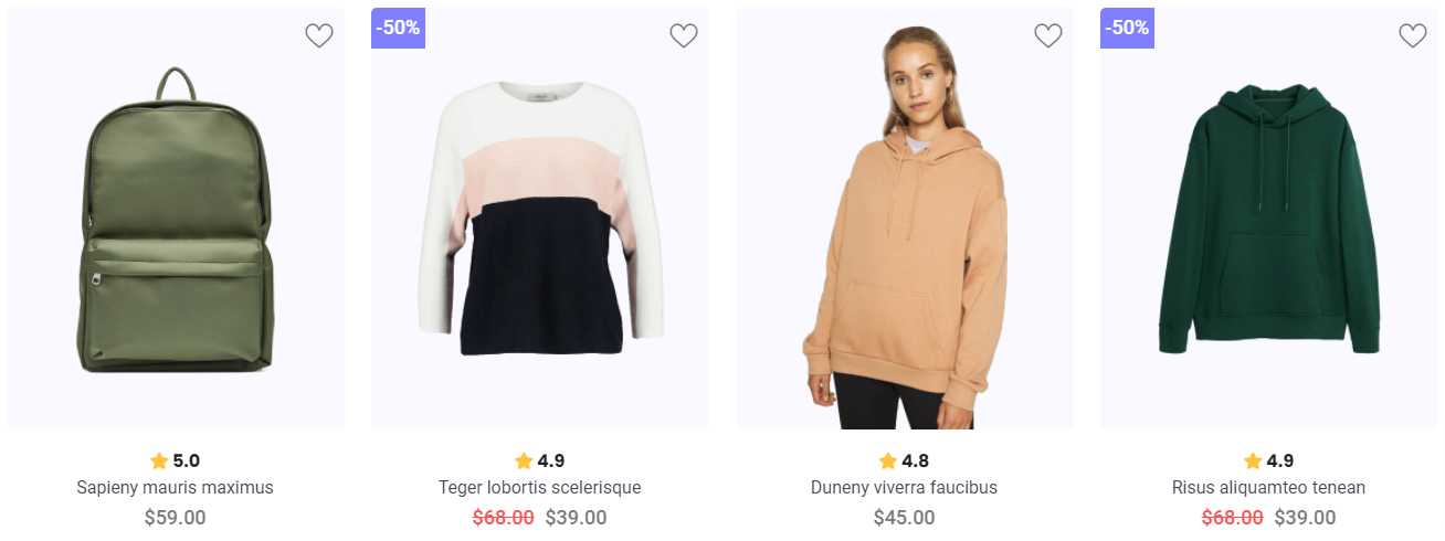
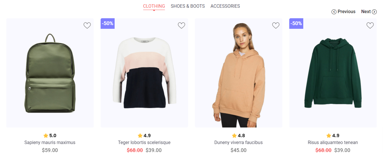
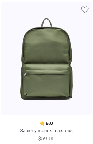
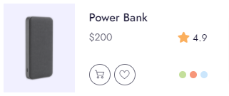
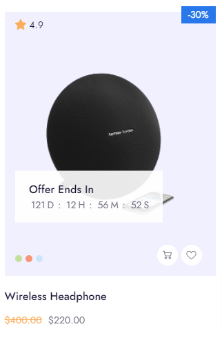
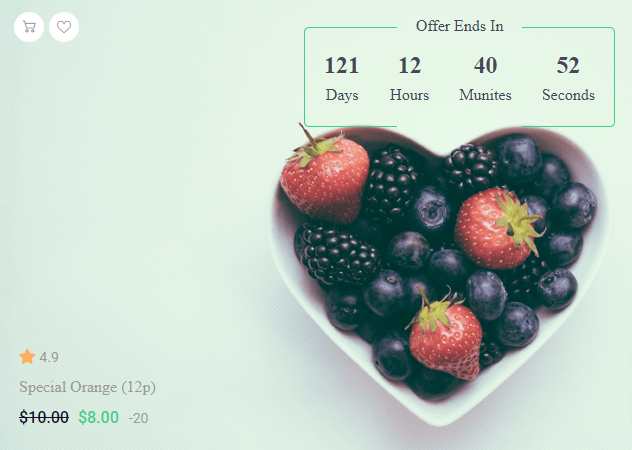
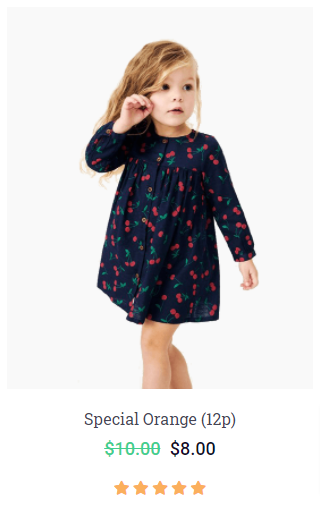
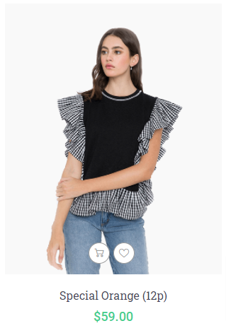
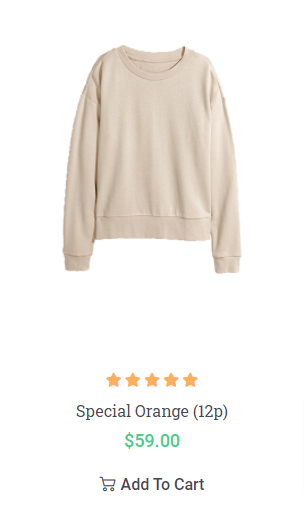
Product Thumbnails Elements

Bigbazar has lot's of variation of product thumbnail. Changing the thumbnail view style you have to change the thumbnails parent class only. Product thumbnail class are listed in the bottom table and describe what style change when added the class.


Note: Product code pattern and include a single product thumb in a row and all the thumb classes added with the row class. Also include a class list and description under bottom table. If you add the classes with the parent row or any where of the parent div of product column.

Class Name Description
.e-bg-light Use this class with parent row <div class="row e-bg-light"> and child product background turn into theme light color using this class.
.e-bg-gray Use this class with parent row <div class="row e-bg-gray"> and child product background turn into theme gray color using this class.
.e-bg-white Use this class with parent row <div class="row e-bg-white"> and child product background turn into theme white color using this class.
.e-image-bg-secondary Make product image background secondary. <div class="row e-image-bg-secondary">
.e-image-bg-light Make product image background light gray. <div class="row e-image-bg-light">
.e-image-bg-primary Make product image background primary. <div class="row e-image-bg-primary">
.product-grid-* Product thumbnail style class. Use 1-5 number replace * <div class="row product-grid-*">

How and Where use the class

You can use the class anywhere of product parent tag <div class="product type-product"> in the bottom where we have use the product settings classes.

<div class="row e-bg-white e-hover-shadow-one e-hover-wrapper-absolute"></div>
<div class="owl-carousel owl-item-mb-40 owl-mx-one owl-nav-hover-primary dot-active-one nav-disable single-carousel product-list e-bg-white e-hover-shadow-one e-hover-wrapper-absolute"></div>

Helping Classes

We have created some really useful helper classes for you. Here are a few of them:
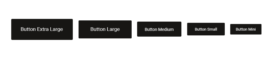
Text Size

  • .font-mini - For extra small size of text
  • .font-general - For general size of text
  • .font-medium - For medium size of text
  • .font-large - For large size of text
  • .font-extra-large - For extra large size of text

Text Color

  • .text-primary - For text primary color of the theme
  • .text-secondary - For text secondary color of the theme
  • .text-general - For text general color of the theme
  • .text-light - For text light color of the theme
  • .text-gray - For text gray color of the theme
  • .text-dark - For text dark color of the theme
  • .text-white - For text white color of the theme

Text Align

  • .text-left - For text align left
  • .text-right - For text align right
  • .text-center - For text align center
  • .text-justify - For text align justify

Text Transform

  • .text-lowercase - For text to lowercase
  • .text-uppercase - For text to uppercase
  • .text-capitalize - For text to capitalize

Font Weight

  • .font-100 - For font weight of 100
  • .font-200 - For font weight of 200
  • .font-300 - For font weight of 300
  • .font-400 - For font weight of 400
  • .font-600 - For font weight of 600
  • .font-700 - For font weight of 700
  • .font-800 - For font weight of 800
  • .font-900 - For font weight of 900

Flat Icon Size

  • .flat-mini - For extra small icon size
  • .flat-small - For small icon size
  • .flat-medium - For medium icon size
  • .flat-large - For large icon size
  • .flat-extra-large - For extra large icon size

Layer Overlay Color

  • .overlay-primary - For a layer or section overlay primary color
  • .overlay-secondary - For a layer or section overlay secondary color
  • .overlay-dark - For a layer or section overlay dark color
  • .overlay-white - For a layer or section overlay white color
  • .overlay-extra - For a layer or section overlay extra color

Template Custom Margin

All the spacing and margin we include from bootstrap referance Spacing and Margin our custom class of margin and spacing include bottom:

For using margin default class {Margin Side}-{Margin Number} We arrange margin numbering by 0, 10, 20, 30, 40, 50 each number means number(px). For example margin class arrange in .m-0, .mt-0, .mr-0, .mb-0, .ml-0, .mx-0, .my-0 here m = all side margin, mt = margin top, mr = margin right, mb = margin bottom, ml = margin left, mx = margin left and right, my = margin top and bottom. Now you can use the number 0 - 50

Now the device issue, if you want to set margin in different screen then the class format becomes {Screen}-{Margin Side}-{Margin Number} Screen issue listed in bottom as example:

  • .lg - For use this class large device under screen 0 - 1199px
  • .md - For use this class medium device under screen 0 - 991px
  • .sm - For use this class small device under screen 0 - 767px
  • .xs - For use this class extra small device under screen 0 - 575px

So the class variation becomes .lg-m-0, .md-m-0, .sm-m-0, .xs-m-0

.my-0, .m-0, .mt-0 { margin-top: 0px !important; }
.my-10, .m-10, .mt-10 { margin-top: 10px !important; }
.my-20, .m-20, .mt-20 { margin-top: 20px !important; }
.my-30, .m-30, .mt-30 { margin-top: 30px !important; }
.my-40, .m-40, .mt-40 { margin-top: 40px !important; }
.my-50, .m-50, .mt-50 { margin-top: 50px !important; }
.my-auto, .m-auto, .mt-auto { margin-top: auto !important; }

.mx-0, .m-0, .mr-0 { margin-right: 0px !important; }
.mx-10, .m-10, .mr-10 { margin-right: 10px !important; }
.mx-20, .m-20, .mr-20 { margin-right: 20px !important; }
.mx-30, .m-30, .mr-30 { margin-right: 30px !important; }
.mx-40, .m-40, .mr-40 { margin-right: 40px !important; }
.mx-50, .m-50, .mr-50 { margin-right: 50px !important; }
.mx-auto, .m-auto, .mr-auto { margin-right: auto !important; }

.my-0, .m-0, .mb-0 { margin-bottom: 0px !important; }
.my-10, .m-10, .mb-10 { margin-bottom: 10px !important; }
.my-20, .m-20, .mb-20 { margin-bottom: 20px !important; }
.my-30, .m-30, .mb-30 { margin-bottom: 30px !important; }
.my-40, .m-40, .mb-40 { margin-bottom: 40px !important; }
.my-50, .m-50, .mb-50 { margin-bottom: 50px !important; }
.my-auto, .m-auto, .mb-auto { margin-bottom: auto !important; }

.mx-0, .m-0, .ml-0 { margin-left: 0px !important; }
.mx-10, .m-10, .ml-10 { margin-left: 10px !important; }
.mx-20, .m-20, .ml-20 { margin-left: 20px !important; }
.mx-30, .m-30, .ml-30 { margin-left: 30px !important; }
.mx-40, .m-40, .ml-40 { margin-left: 40px !important; }
.mx-50, .m-50, .ml-50 { margin-left: 50px !important; }
.mx-auto, .m-auto, .ml-auto { margin-left: auto !important; }
											

Template Custom Padding

All the spacing and padding we include from bootstrap referance Spacing and Padding our custom class of padding and spacing include bottom:

For using padding default class {Padding Side}-{Padding Number} We arrange padding numbering by 0, 10, 20, 30, 40, 50 each number means number(px). For example padding class arrange in .m-0, .pt-0, .pr-0, .pb-0, .pl-0, .px-0, .py-0 here m = all side padding, mt = padding top, mr = padding right, mb = padding bottom, ml = padding left, mx = padding left and right, my = padding top and bottom. Now you can use the number 0 - 50

Now the device issue, if you want to set padding in different screen then the class format becomes {Screen}-{Padding Side}-{Padding Number} Screen issue listed in bottom as example:

  • .lg - For use this class large device under screen 0 - 1199px
  • .md - For use this class medium device under screen 0 - 991px
  • .sm - For use this class small device under screen 0 - 767px
  • .xs - For use this class extra small device under screen 0 - 575px

So the class variation becomes .lg-p-0, .md-p-0, .sm-p-0, .xs-p-0

.py-0, .p-0, .pt-0 { padding-top: 0px !important; }
.py-10, .p-10, .pt-10 { padding-top: 10px !important; }
.py-20, .p-20, .pt-20 { padding-top: 20px !important; }
.py-30, .p-30, .pt-30 { padding-top: 30px !important; }
.py-40, .p-40, .pt-40 { padding-top: 40px !important; }
.py-50, .p-50, .pt-50 { padding-top: 50px !important; }
.py-auto, .p-auto, .pt-auto { padding-top: auto !important; }

.px-0, .p-0, .pr-0 { padding-right: 0px !important; }
.px-10, .p-10, .pr-10 { padding-right: 10px !important; }
.px-20, .p-20, .pr-20 { padding-right: 20px !important; }
.px-30, .p-30, .pr-30 { padding-right: 30px !important; }
.px-40, .p-40, .pr-40 { padding-right: 40px !important; }
.px-50, .p-50, .pr-50 { padding-right: 50px !important; }
.px-auto, .p-auto, .pr-auto { padding-right: auto !important; }

.py-0, .p-0, .pb-0 { padding-bottom: 0px !important; }
.py-10, .p-10, .pb-10 { padding-bottom: 10px !important; }
.py-20, .p-20, .pb-20 { padding-bottom: 20px !important; }
.py-30, .p-30, .pb-30 { padding-bottom: 30px !important; }
.py-40, .p-40, .pb-40 { padding-bottom: 40px !important; }
.py-50, .p-50, .pb-50 { padding-bottom: 50px !important; }
.py-auto, .p-auto, .pb-auto { padding-bottom: auto !important; }

.px-0, .p-0, .pl-0 { padding-left: 0px !important; }
.px-10, .p-10, .pl-10 { padding-left: 10px !important; }
.px-20, .p-20, .pl-20 { padding-left: 20px !important; }
.px-30, .p-30, .pl-30 { padding-left: 30px !important; }
.px-40, .p-40, .pl-40 { padding-left: 40px !important; }
.px-50, .p-50, .pl-50 { padding-left: 50px !important; }
.px-auto, .p-auto, .pl-auto { padding-left: auto !important; }
											

Float

Bootstrap flot class link referance Floting in bootstrap

  • .float-left - Float DIV to left
  • .float-right - Float DIV to right
  • .float-none - No float

Display

Bootstrap display class link referance Display property in bootstrap

  • .d-block - For display block
  • .d-inline-block - For display inline-block
  • .d-inline - For display inline
  • .d-none - For display none
  • .d-inheri - For display inherit
  • .d-table - For display table
  • .d-table-cell - For display table-cell
  • .overflow-hidden - For overflow hidden
  • .overflow-visible - For overflow visible
  • .overflow-auto - For overflow auto
  • .xl-d-none - For display none when screen max width 0 - 1399px
  • .lg-d-none - For display none when screen max width 0 - 1199px
  • .md-d-none - For display none when screen max width 0 - 991px
  • .sm-d-none - For display none when screen max width 0 - 767px
  • .xs-d-none - For display none when screen max width 0 - 575px

Position

Bootstrap position class link referance Position class in bootstrap

  • .position-inherit - For element position inherit
  • .position-relative - For element position relative
  • .position-absolute - For element position absolute
  • .position-fixed - For element position fixed
  • .position-right - For element position fixed to right of the body or parent element
  • .position-left - For element position fixed to left of the body or parent element
  • .position-top - For element position fixed to top of the body or parent element

Width

  • .w-mx-100 - Set max width 100%
  • .box-100px - Set a div width and height 100px
  • .box-70px - Set a div width and height 70px

Miscellaneous

  • .top-0 - Set top 0 after position absolute
  • .right-0 - Set right 0 after position absolute
  • .bottom-0 - Set bottom 0 after position absolute
  • .left-0 - Set left 0 after position absolute

Accordions

Extend the default collapse behavior to create an accordion with the panel component. See below image and code for more information.

Accordions plus

<div class="bb-accordion ac-single-show accordion-plus-left">
	<!-- Accordion Start -->
	<div class="ac-card">
		<a class="ac-toggle d-block py-2 text-secondary font-medium higlight-font active" href="javascript:void(0);">Website and Mobile App Design</a>
		<div class="ac-collapse show" style="display: block">
			<p>Lorem ipsum dolor sit amet, consectetur adipisicing elit, sed do eiusmod tempor incididunt ut labore et dolore magna aliqua. Ut enim ad minim veniam, quis nostrud exercitation ullamco laboris nisi ut aliquip ex ea commodo consequat. Duis aute irure dolor in reprehenderit in voluptate velit esse cillum.</p>
		</div>
	</div>
	<!-- Accordion Start -->
	<div class="ac-card">
		<a class="ac-toggle d-block py-2 text-secondary font-medium higlight-font" href="javascript:void(0);">Motion Graphics and Animation</a>
		<div class="ac-collapse">
			<p>Lorem ipsum dolor sit amet, consectetur adipisicing elit, sed do eiusmod tempor incididunt ut labore et dolore magna aliqua. Ut enim ad minim veniam, quis nostrud exercitation ullamco laboris nisi ut aliquip ex ea commodo consequat. Duis aute irure dolor in reprehenderit in voluptate velit esse cillum.</p>
		</div>
	</div>
	<!-- Accordion Start -->
	<div class="ac-card">
		<a class="ac-toggle d-block py-2 text-secondary font-medium higlight-font" href="javascript:void(0);">User Experience and Brand Strategy</a>
		<div class="ac-collapse">
			<p>Lorem ipsum dolor sit amet, consectetur adipisicing elit, sed do eiusmod tempor incididunt ut labore et dolore magna aliqua. Ut enim ad minim veniam, quis nostrud exercitation ullamco laboris nisi ut aliquip ex ea commodo consequat. Duis aute irure dolor in reprehenderit in voluptate velit esse cillum.</p>
		</div>
	</div>
</div>

Accordions Single Border

<div class="bb-accordion ac-single-show accordion-plus-right">
	<!-- Accordion Start -->
	<div class="ac-card border-bottom border-dark mb-2">
		<a class="ac-toggle d-block py-2 text-primary hover-text-primary font-weight-medium higlight-font active h4" href="javascript:void(0);">How can I install the App?</a>
		<div class="ac-collapse show" style="display: block">
			<p>Lorem Ipsum is simply dummy text of the printing and typesetting industry. Lorem Ipsum has been the industry's standard dummy text ever since the 1500s, when an unknown..</p>
		</div>
	</div>
	<!-- Accordion Start -->
	<div class="ac-card border-bottom border-dark mb-2">
		<a class="ac-toggle d-block py-2 text-primary hover-text-primary font-weight-medium higlight-font h4" href="javascript:void(0);">What is the Main Features of this App?</a>
		<div class="ac-collapse">
			<p>Lorem Ipsum is simply dummy text of the printing and typesetting industry. Lorem Ipsum has been the industry's standard dummy text ever since the 1500s, when an unknown..</p>
		</div>
	</div>
	<!-- Accordion Start -->
	<div class="ac-card border-bottom border-dark mb-2">
		<a class="ac-toggle d-block py-2 text-primary hover-text-primary font-weight-medium higlight-font h4" href="javascript:void(0);">Is there any Video Sessions?</a>
		<div class="ac-collapse">
			<p>Lorem Ipsum is simply dummy text of the printing and typesetting industry. Lorem Ipsum has been the industry's standard dummy text ever since the 1500s, when an unknown..</p>
		</div>
	</div>
</div>

Animation

Scroll the page and used animation class will load by animated, you can control the animation using transation time and transation delay. Here the sample code:

<div class="wow slideInLeft" data-wow-duration="1200ms" data-wow-delay="500ms">
    ...
</div>

NoteDelay duration is in milliseconds.

Here is the list of the Animation Types you can use:

  • bounce
  • flash
  • pulse
  • rubberBand
  • shake
  • swing
  • tada
  • wobble
  • bounceIn
  • bounceInDown
  • bounceInLeft
  • bounceInRight
  • bounceInUp
  • bounceOut
  • bounceOutDown
  • bounceOutLeft
  • bounceOutRight
  • bounceOutUp
  • fadeIn
  • fadeInDown
  • fadeInDownBig
  • fadeInLeft
  • fadeInLeftBig
  • fadeInRight
  • fadeInRightBig
  • fadeInUp
  • fadeInUpBig
  • fadeOut
  • fadeOutDown
  • fadeOutDownBig
  • fadeOutLeft
  • fadeOutLeftBig
  • fadeOutRight
  • fadeOutRightBig
  • fadeOutUp
  • fadeOutUpBig
  • flip
  • flipInX
  • flipInY
  • flipOutX
  • flipOutY
  • lightSpeedIn
  • lightSpeedOut
  • rotateIn
  • rotateInDownLeft
  • rotateInDownRight
  • rotateInUpLeft
  • rotateInUpRight
  • rotateOut
  • rotateOutDownLeft
  • rotateOutDownRight
  • rotateOutUpLeft
  • rotateOutUpRight
  • hinge
  • rollIn
  • rollOut
  • zoomIn
  • zoomInDown
  • zoomInLeft
  • zoomInRight
  • zoomInUp
  • zoomOut
  • zoomOutDown
  • zoomOutLeft
  • zoomOutRight
  • zoomOutUp

Blog Post

Beautiful bog post layouts to display your content with attractive look. See below image and code for more information.

Custom Blog Style

Custom blog thumbnail design using class element

<div class="row row-cols-lg-2 row-cols-1 g-4">
	<div class="col">
		<div class="grid-thumb-1 transation">
			<div class="image-area">
				<a href="#"><img src="assets/images/blog/1.png" alt=""></a>
			</div>
			<div class="content">
				<h4 class="title mb-0"><a href="#">9 Most Awesome Lake With Nature...</a></h4>
				<div class="date-1"><span>traveling_</span><span>jan 10 , 2021</span></div>
				<div class="blog-text">
					<p>This is Photoshop's version of Lorem Ipsum. Proin gravida nibh vel velit auctor aliquet. Aenean.</p>
				</div>
				<div class="blog-meta">
					<div class="date-2 me-4"><a href="#"><i class="far fa-calendar-alt me-1"></i> <span>21 May,2021</span></a></div>
					<div class="comment-1"><a href="#"><i class="far fa-comments me-1"></i> <span>3 Comments</span></a></div>
				</div>
				<div class="footer">
					<a href="#" class="btn-link-2"><span>Continue reading</span></a>
					<div class="comment-2"><a href="#"><i class="flaticon-chat-1"></i> <span>6</span></a></div>
				</div>
			</div>
		</div>
	</div>
	<div class="col">
		<div class="grid-thumb-1 transation">
			<div class="image-area">
				<a href="#"><img src="assets/images/blog/2.png" alt=""></a>
			</div>
			<div class="content">
				<h4 class="title mb-0"><a href="#">9 Most Awesome Lake With Nature...</a></h4>
				<div class="date-1"><span>traveling_</span><span>jan 10 , 2021</span></div>
				<div class="blog-text">
					<p>This is Photoshop's version of Lorem Ipsum. Proin gravida nibh vel velit auctor aliquet. Aenean.</p>
				</div>
				<div class="blog-meta">
					<div class="date-2 me-4"><a href="#"><i class="far fa-calendar-alt me-1"></i> <span>21 May,2021</span></a></div>
					<div class="comment-1"><a href="#"><i class="far fa-comments me-1"></i> <span>3 Comments</span></a></div>
				</div>
				<div class="footer">
					<a href="#" class="btn-link-2"><span>Continue reading</span></a>
					<div class="comment-2"><a href="#"><i class="flaticon-chat-1"></i> <span>6</span></a></div>
				</div>
			</div>
		</div>
	</div>
</div>

Note: For demo, You can please check this in blog-post.html page.


Blockquote

Wrap <blockquote> around any HTML as the quote. For straight quotes, we recommend a <p>.</p>

<blockquote class="text-primary py-4">“This is Photoshop's version of Lorem Ipsum. Proin gravida nibh vel velit auctor aliquet. Aenean sollicitudin, lorem quis bibendum auctor”</blockquote>

Buttons

Use the button classes on an <a> and <button> element.

<!-- start buttons -->
<a href="#" class="btn btn-extra-large btn-secondary">Button Extra Large</a>
<a href="#" class="btn btn-large btn-secondary">Button Large</a>
<a href="#" class="btn btn-medium btn-secondary">Button Medium</a>
<a href="#" class="btn btn-small btn-secondary">Button Small</a>
<a href="#" class="btn btn-mini btn-secondary">Extra Mini</a>
<!-- end buttons -->

Clients Logo

<div class="bg-white">
	<div class="container">
		<div class="row">
			<div class="col-md-12">
				<div class="owl-carousel partner-slider py-10 border-top border-bottom">
					<div class="item">
						<a href="#"><img src="assets/images/partner/1.png" alt="Image not found!" /></a>
					</div>
					<div class="item">
						<a href="#"><img src="assets/images/partner/2.png" alt="Image not found!" /></a>
					</div>
					<div class="item">
						<a href="#"><img src="assets/images/partner/3.png" alt="Image not found!" /></a>
					</div>
					<div class="item">
						<a href="#"><img src="assets/images/partner/4.png" alt="Image not found!" /></a>
					</div>
					<div class="item">
						<a href="#"><img src="assets/images/partner/5.png" alt="Image not found!" /></a>
					</div>
					<div class="item">
						<a href="#"><img src="assets/images/partner/6.png" alt="Image not found!" /></a>
					</div>
					<div class="item">
						<a href="#"><img src="assets/images/partner/7.png" alt="Image not found!" /></a>
					</div>
					<div class="item">
						<a href="#"><img src="assets/images/partner/8.png" alt="Image not found!" /></a>
					</div>
				</div>
			</div>
		</div>
	</div>
</div>

Client Logo Carousel

<div class="row">
	<div class="col-md-12">
		<div class="owl-carousel partner-slider autoplay-on">
			<div class="item"> <a href="#"><img src="assets/images/partner/19.png" alt="Image not found!"/></a> </div>
			<div class="item"> <a href="#"><img src="assets/images/partner/20.png" alt="Image not found!"/></a> </div>
			<div class="item"> <a href="#"><img src="assets/images/partner/21.png" alt="Image not found!"/></a> </div>
			<div class="item"> <a href="#"><img src="assets/images/partner/22.png" alt="Image not found!"/></a> </div>
			<div class="item"> <a href="#"><img src="assets/images/partner/23.png" alt="Image not found!"/></a> </div>
		</div>
	</div>
</div>

Carousel

Ecommerce product carousel shortcode, all of the carousel listed here:

Single Row Product Carousel

<div class="row">
	<div class="col-12">
		<div class="products product-grid-1 owl-mx-4">
			<div class="four-carousel owl-carousel autoplay-off owl-nav-3 dot-disable e-image-bg-light e-info-center">
				<div class="item">
					<div class="product type-product">
						<div class="product-wrapper">
							<div class="product-image">
								<a href="#" class="woocommerce-LoopProduct-link"><img src="assets/images/products/product_18_1.png" alt="Product Not Found!"></a>
								<div class="e-buttons-set">
									<div class="quickview-button">
										<a class="quickview-btn" href="#" data-bs-toggle="tooltip" data-bs-original-title="Quick View">Quick View</a>
									</div>
									<div class="cart-button">
										<a href="#" class="button add_to_cart_button">Add to Cart</a>
									</div>
									<div class="wishlist-button">
										<a class="add_to_wishlist" href="#" data-bs-toggle="tooltip" data-bs-original-title="Add to Wishlist">Wishlist</a>
									</div>
									<div class="compare-button">
										<a class="compare button" href="#" data-bs-toggle="tooltip" data-bs-original-title="Compare">Compare</a>
									</div>
								</div>
								<div class="sale-and-badge">
									<div class="product-labels">
										<div class="badge-new"><span>New</span></div>
									</div>
								</div>
								<div class="shipping-feed-back">
									<div class="star-rating">
										<div class="rating-wrap">
											<a href="#"><i class="fas fa-star"></i><span> 5.0</span></a>
										</div>
										<div class="rating-counts-wrap">
											<a href="#">(563)</a>
										</div>
									</div>
								</div>
								<div class="product-variations">
									<span class="active"><a href="#" style="background-color: #c4df9b;"></a></span>
									<span><a href="#" style="background-color: #f69679;"></a></span>
									<span><a href="#" style="background-color: #cbe6fc;"></a></span>
								</div>
								<div class="offer-end">
									<span>Offer Ends In</span>
									<div class="time-count-1" data-countdown="2021/12/31">
										<ul>
											<li><span>191</span><span></span></li>
											<li><span>10</span><span></span></li>
											<li><span>50</span><span></span></li>
											<li><span>45</span><span></span></li>
										</ul>
									</div>
								</div>
							</div>
							<div class="product-info">
								<div class="shipping-feed-back">
									<div class="star-rating">
										<div class="rating-wrap">
											<a href="#"><i class="fas fa-star"></i><span> 5.0</span></a>
										</div>
										<div class="rating-counts-wrap">
											<a href="#">(563)</a>
										</div>
									</div>
								</div>
								<h6 class="product-title"><a href="#">Sapieny mauris maximus</a></h6>
								<div class="product-price">
									<div class="price">
										<ins>$59.00</ins>
									</div>
								</div>
							</div>
						</div>
					</div>
				</div>
				<div class="item">
					<div class="product type-product">
						<div class="product-wrapper">
							<div class="product-image">
								<a href="#" class="woocommerce-LoopProduct-link"><img src="assets/images/products/product_19_1.png" alt="Product Not Found!"></a>
								<div class="e-buttons-set">
									<div class="quickview-button">
										<a class="quickview-btn" href="#" data-bs-toggle="tooltip" data-bs-original-title="Quick View">Quick View</a>
									</div>
									<div class="cart-button">
										<a href="#" class="button add_to_cart_button">Add to Cart</a>
									</div>
									<div class="wishlist-button">
										<a class="add_to_wishlist" href="#" data-bs-toggle="tooltip" data-bs-original-title="Add to Wishlist">Wishlist</a>
									</div>
									<div class="compare-button">
										<a class="compare button" href="#" data-bs-toggle="tooltip" data-bs-original-title="Compare">Compare</a>
									</div>
								</div>
								<div class="sale-and-badge">
									<div class="product-labels">
										<div class="badge-new"><span>New</span></div>
									</div>
									<div class="on-sale"><span>-50</span><span>%</span><span>off</span></div>
								</div>
								<div class="shipping-feed-back">
									<div class="star-rating">
										<div class="rating-wrap">
											<a href="#"><i class="fas fa-star"></i><span> 4.5</span></a>
										</div>
										<div class="rating-counts-wrap">
											<a href="#">(563)</a>
										</div>
									</div>
								</div>
								<div class="product-variations">
									<span class="active"><a href="#" style="background-color: #c4df9b;"></a></span>
									<span><a href="#" style="background-color: #f69679;"></a></span>
									<span><a href="#" style="background-color: #cbe6fc;"></a></span>
								</div>
								<div class="offer-end">
									<span>Offer Ends In</span>
									<div class="time-count-1" data-countdown="2021/12/31">
										<ul>
											<li><span>191</span><span></span></li>
											<li><span>10</span><span></span></li>
											<li><span>50</span><span></span></li>
											<li><span>45</span><span></span></li>
										</ul>
									</div>
								</div>
							</div>
							<div class="product-info">
								<div class="shipping-feed-back">
									<div class="star-rating">
										<div class="rating-wrap">
											<a href="#"><i class="fas fa-star"></i><span> 4.9</span></a>
										</div>
										<div class="rating-counts-wrap">
											<a href="#">(563)</a>
										</div>
									</div>
								</div>
								<h6 class="product-title"><a href="#">Teger lobortis scelerisque</a></h6>
								<div class="product-price">
									<div class="price">
										<del>$68.00</del>
										<ins>$39.00</ins>
									</div>
									<div class="on-sale"><span>-50</span><span>%</span><span>off</span></div>
								</div>
							</div>
						</div>
					</div>
				</div>
				<div class="item">
					<div class="product type-product">
						<div class="product-wrapper">
							<div class="product-image">
								<a href="#" class="woocommerce-LoopProduct-link"><img src="assets/images/products/product_20_1.png" alt="Product Not Found!"></a>
								<div class="e-buttons-set">
									<div class="quickview-button">
										<a class="quickview-btn" href="#" data-bs-toggle="tooltip" data-bs-original-title="Quick View">Quick View</a>
									</div>
									<div class="cart-button">
										<a href="#" class="button add_to_cart_button">Add to Cart</a>
									</div>
									<div class="wishlist-button">
										<a class="add_to_wishlist" href="#" data-bs-toggle="tooltip" data-bs-original-title="Add to Wishlist">Wishlist</a>
									</div>
									<div class="compare-button">
										<a class="compare button" href="#" data-bs-toggle="tooltip" data-bs-original-title="Compare">Compare</a>
									</div>
								</div>
								<div class="shipping-feed-back">
									<div class="star-rating">
										<div class="rating-wrap">
											<a href="#"><i class="fas fa-star"></i><span> 4.9</span></a>
										</div>
										<div class="rating-counts-wrap">
											<a href="#">(563)</a>
										</div>
									</div>
								</div>
								<div class="product-variations">
									<span class="active"><a href="#" style="background-color: #c4df9b;"></a></span>
									<span><a href="#" style="background-color: #f69679;"></a></span>
									<span><a href="#" style="background-color: #cbe6fc;"></a></span>
								</div>
								<div class="offer-end">
									<span>Offer Ends In</span>
									<div class="time-count-1" data-countdown="2021/12/31">
										<ul>
											<li><span>191</span><span></span></li>
											<li><span>10</span><span></span></li>
											<li><span>50</span><span></span></li>
											<li><span>45</span><span></span></li>
										</ul>
									</div>
								</div>
							</div>
							<div class="product-info">
								<div class="shipping-feed-back">
									<div class="star-rating">
										<div class="rating-wrap">
											<a href="#"><i class="fas fa-star"></i><span> 4.8</span></a>
										</div>
										<div class="rating-counts-wrap">
											<a href="#">(563)</a>
										</div>
									</div>
								</div>
								<h6 class="product-title"><a href="#">Duneny viverra faucibus</a></h6>
								<div class="product-price">
									<div class="price">
										<ins>$45.00</ins>
									</div>
									<div class="on-sale"><span>-30</span><span>%</span><span>off</span></div>
								</div>
							</div>
						</div>
					</div>
				</div>
			</div>
		</div>
	</div>
</div>

Single Row Product Carousel and tab

<div class="full-row pb-0">
	<div class="container">
		<div class="row">
			<div class="col-12">
				<div class="section-top d-flex flex-column justify-content-center">
					<div class="title-area">
						<h2 class="title mb-0">New Arrivals</h2>
					</div>
					<div class="tab-style-1 mt-4">
						<ul class="nav nav-pills">
							<li class="nav-item">
								<a href="#pill1-clothing" class="nav-link active" data-bs-toggle="pill">Clothing</a>
							</li>
							<li class="nav-item">
								<a href="#pill1-shoes" class="nav-link" data-bs-toggle="pill">Shoes & Boots</a>
							</li>
							<li class="nav-item">
								<a href="#pill1-accessory" class="nav-link" data-bs-toggle="pill">Accessories</a>
							</li>
						</ul>
					</div>
				</div>
			</div>
		</div>
		<div class="row">
			<div class="col-12">
				<div class="tab-content">
					<div class="tab-pane fade show active" id="pill1-clothing">
						<div class="products product-grid-1 owl-mx-4">
							<div class="four-carousel owl-carousel autoplay-off owl-nav-4 dot-disable e-image-bg-light e-info-center">
								<div class="item">
									<div class="product type-product">
										<div class="product-wrapper">
											<div class="product-image">
												<a href="#" class="woocommerce-LoopProduct-link"><img src="assets/images/products/product_1_1.png" alt="Product Not Found!"></a>
												<div class="e-buttons-set">
													<div class="quickview-button">
														<a class="quickview-btn" href="#" data-bs-toggle="tooltip" data-bs-original-title="Quick View">Quick View</a>
													</div>
													<div class="cart-button">
														<a href="#" class="button add_to_cart_button">Add to Cart</a>
													</div>
													<div class="wishlist-button">
														<a class="add_to_wishlist" href="#" data-bs-toggle="tooltip" data-bs-original-title="Add to Wishlist">Wishlist</a>
													</div>
													<div class="compare-button">
														<a class="compare button" href="#" data-bs-toggle="tooltip" data-bs-original-title="Compare">Compare</a>
													</div>
												</div>
												<div class="sale-and-badge">
													<div class="product-labels">
														<div class="badge-new"><span>New</span></div>
													</div>
												</div>
												<div class="shipping-feed-back">
													<div class="star-rating">
														<div class="rating-wrap">
															<a href="#"><i class="fas fa-star"></i><span> 5.0</span></a>
														</div>
														<div class="rating-counts-wrap">
															<a href="#">(563)</a>
														</div>
													</div>
												</div>
												<div class="product-variations">
													<span class="active"><a href="#" style="background-color: #c4df9b;"></a></span>
													<span><a href="#" style="background-color: #f69679;"></a></span>
													<span><a href="#" style="background-color: #cbe6fc;"></a></span>
												</div>
												<div class="offer-end">
													<span>Offer Ends In</span>
													<div class="time-count-1" data-countdown="2021/12/31">
														<ul>
															<li><span>191</span><span></span></li>
															<li><span>10</span><span></span></li>
															<li><span>50</span><span></span></li>
															<li><span>45</span><span></span></li>
														</ul>
													</div>
												</div>
											</div>
											<div class="product-info">
												<div class="shipping-feed-back">
													<div class="star-rating">
														<div class="rating-wrap">
															<a href="#"><i class="fas fa-star"></i><span> 5.0</span></a>
														</div>
														<div class="rating-counts-wrap">
															<a href="#">(563)</a>
														</div>
													</div>
												</div>
												<h6 class="product-title"><a href="#">Sapieny mauris maximus</a></h6>
												<div class="product-price">
													<div class="price">
														<ins>$59.00</ins>
													</div>
												</div>
											</div>
										</div>
									</div>
								</div>
								<div class="item">
									<div class="product type-product">
										<div class="product-wrapper">
											<div class="product-image">
												<a href="#" class="woocommerce-LoopProduct-link"><img src="assets/images/products/product_2_1.png" alt="Product Not Found!"></a>
												<div class="e-buttons-set">
													<div class="quickview-button">
														<a class="quickview-btn" href="#" data-bs-toggle="tooltip" data-bs-original-title="Quick View">Quick View</a>
													</div>
													<div class="cart-button">
														<a href="#" class="button add_to_cart_button">Add to Cart</a>
													</div>
													<div class="wishlist-button">
														<a class="add_to_wishlist" href="#" data-bs-toggle="tooltip" data-bs-original-title="Add to Wishlist">Wishlist</a>
													</div>
													<div class="compare-button">
														<a class="compare button" href="#" data-bs-toggle="tooltip" data-bs-original-title="Compare">Compare</a>
													</div>
												</div>
												<div class="sale-and-badge">
													<div class="product-labels">
														<div class="badge-new"><span>New</span></div>
													</div>
													<div class="on-sale"><span>-50</span><span>%</span><span>off</span></div>
												</div>
												<div class="shipping-feed-back">
													<div class="star-rating">
														<div class="rating-wrap">
															<a href="#"><i class="fas fa-star"></i><span> 4.5</span></a>
														</div>
														<div class="rating-counts-wrap">
															<a href="#">(563)</a>
														</div>
													</div>
												</div>
												<div class="product-variations">
													<span class="active"><a href="#" style="background-color: #c4df9b;"></a></span>
													<span><a href="#" style="background-color: #f69679;"></a></span>
													<span><a href="#" style="background-color: #cbe6fc;"></a></span>
												</div>
												<div class="offer-end">
													<span>Offer Ends In</span>
													<div class="time-count-1" data-countdown="2021/12/31">
														<ul>
															<li><span>191</span><span></span></li>
															<li><span>10</span><span></span></li>
															<li><span>50</span><span></span></li>
															<li><span>45</span><span></span></li>
														</ul>
													</div>
												</div>
											</div>
											<div class="product-info">
												<div class="shipping-feed-back">
													<div class="star-rating">
														<div class="rating-wrap">
															<a href="#"><i class="fas fa-star"></i><span> 4.9</span></a>
														</div>
														<div class="rating-counts-wrap">
															<a href="#">(563)</a>
														</div>
													</div>
												</div>
												<h6 class="product-title"><a href="#">Teger lobortis scelerisque</a></h6>
												<div class="product-price">
													<div class="price">
														<del>$68.00</del>
														<ins>$39.00</ins>
													</div>
													<div class="on-sale"><span>-50</span><span>%</span><span>off</span></div>
												</div>
											</div>
										</div>
									</div>
								</div>
								<div class="item">
									<div class="product type-product">
										<div class="product-wrapper">
											<div class="product-image">
												<a href="#" class="woocommerce-LoopProduct-link"><img src="assets/images/products/product_3_1.png" alt="Product Not Found!"></a>
												<div class="e-buttons-set">
													<div class="quickview-button">
														<a class="quickview-btn" href="#" data-bs-toggle="tooltip" data-bs-original-title="Quick View">Quick View</a>
													</div>
													<div class="cart-button">
														<a href="#" class="button add_to_cart_button">Add to Cart</a>
													</div>
													<div class="wishlist-button">
														<a class="add_to_wishlist" href="#" data-bs-toggle="tooltip" data-bs-original-title="Add to Wishlist">Wishlist</a>
													</div>
													<div class="compare-button">
														<a class="compare button" href="#" data-bs-toggle="tooltip" data-bs-original-title="Compare">Compare</a>
													</div>
												</div>
												<div class="shipping-feed-back">
													<div class="star-rating">
														<div class="rating-wrap">
															<a href="#"><i class="fas fa-star"></i><span> 4.9</span></a>
														</div>
														<div class="rating-counts-wrap">
															<a href="#">(563)</a>
														</div>
													</div>
												</div>
												<div class="product-variations">
													<span class="active"><a href="#" style="background-color: #c4df9b;"></a></span>
													<span><a href="#" style="background-color: #f69679;"></a></span>
													<span><a href="#" style="background-color: #cbe6fc;"></a></span>
												</div>
												<div class="offer-end">
													<span>Offer Ends In</span>
													<div class="time-count-1" data-countdown="2021/12/31">
														<ul>
															<li><span>191</span><span></span></li>
															<li><span>10</span><span></span></li>
															<li><span>50</span><span></span></li>
															<li><span>45</span><span></span></li>
														</ul>
													</div>
												</div>
											</div>
											<div class="product-info">
												<div class="shipping-feed-back">
													<div class="star-rating">
														<div class="rating-wrap">
															<a href="#"><i class="fas fa-star"></i><span> 4.8</span></a>
														</div>
														<div class="rating-counts-wrap">
															<a href="#">(563)</a>
														</div>
													</div>
												</div>
												<h6 class="product-title"><a href="#">Duneny viverra faucibus</a></h6>
												<div class="product-price">
													<div class="price">
														<ins>$45.00</ins>
													</div>
													<div class="on-sale"><span>-30</span><span>%</span><span>off</span></div>
												</div>
											</div>
										</div>
									</div>
								</div>
								<div class="item">
									<div class="product type-product">
										<div class="product-wrapper">
											<div class="product-image">
												<a href="#" class="woocommerce-LoopProduct-link"><img src="assets/images/products/product_4_1.png" alt="Product Not Found!"></a>
												<div class="e-buttons-set">
													<div class="quickview-button">
														<a class="quickview-btn" href="#" data-bs-toggle="tooltip" data-bs-original-title="Quick View">Quick View</a>
													</div>
													<div class="cart-button">
														<a href="#" class="button add_to_cart_button">Add to Cart</a>
													</div>
													<div class="wishlist-button">
														<a class="add_to_wishlist" href="#" data-bs-toggle="tooltip" data-bs-original-title="Add to Wishlist">Wishlist</a>
													</div>
													<div class="compare-button">
														<a class="compare button" href="#" data-bs-toggle="tooltip" data-bs-original-title="Compare">Compare</a>
													</div>
												</div>
												<div class="sale-and-badge">
													<div class="product-labels">
														<div class="badge-new"><span>New</span></div>
													</div>
													<div class="on-sale"><span>-50</span><span>%</span><span>off</span></div>
												</div>
												<div class="shipping-feed-back">
													<div class="star-rating">
														<div class="rating-wrap">
															<a href="#"><i class="fas fa-star"></i><span> 4.9</span></a>
														</div>
														<div class="rating-counts-wrap">
															<a href="#">(563)</a>
														</div>
													</div>
												</div>
												<div class="product-variations">
													<span class="active"><a href="#" style="background-color: #c4df9b;"></a></span>
													<span><a href="#" style="background-color: #f69679;"></a></span>
													<span><a href="#" style="background-color: #cbe6fc;"></a></span>
												</div>
												<div class="offer-end">
													<span>Offer Ends In</span>
													<div class="time-count-1" data-countdown="2021/12/31">
														<ul>
															<li><span>191</span><span></span></li>
															<li><span>10</span><span></span></li>
															<li><span>50</span><span></span></li>
															<li><span>45</span><span></span></li>
														</ul>
													</div>
												</div>
											</div>
											<div class="product-info">
												<div class="shipping-feed-back">
													<div class="star-rating">
														<div class="rating-wrap">
															<a href="#"><i class="fas fa-star"></i><span> 4.9</span></a>
														</div>
														<div class="rating-counts-wrap">
															<a href="#">(563)</a>
														</div>
													</div>
												</div>
												<h6 class="product-title"><a href="#">Risus aliquamteo tenean</a></h6>
												<div class="product-price">
													<div class="price">
														<del>$68.00</del>
														<ins>$39.00</ins>
													</div>
													<div class="on-sale"><span>-30</span><span>%</span><span>off</span></div>
												</div>
											</div>
										</div>
									</div>
								</div>
								<div class="item">
									<div class="product type-product">
										<div class="product-wrapper">
											<div class="product-image">
												<a href="#" class="woocommerce-LoopProduct-link"><img src="assets/images/products/product_5_1.png" alt="Product Not Found!"></a>
												<div class="e-buttons-set">
													<div class="quickview-button">
														<a class="quickview-btn" href="#" data-bs-toggle="tooltip" data-bs-original-title="Quick View">Quick View</a>
													</div>
													<div class="cart-button">
														<a href="#" class="button add_to_cart_button">Add to Cart</a>
													</div>
													<div class="wishlist-button">
														<a class="add_to_wishlist" href="#" data-bs-toggle="tooltip" data-bs-original-title="Add to Wishlist">Wishlist</a>
													</div>
													<div class="compare-button">
														<a class="compare button" href="#" data-bs-toggle="tooltip" data-bs-original-title="Compare">Compare</a>
													</div>
												</div>
												<div class="sale-and-badge">
													<div class="product-labels">
														<div class="badge-new"><span>New</span></div>
													</div>
													<div class="on-sale"><span>-50</span><span>%</span><span>off</span></div>
												</div>
												<div class="shipping-feed-back">
													<div class="star-rating">
														<div class="rating-wrap">
															<a href="#"><i class="fas fa-star"></i><span> 4.9</span></a>
														</div>
														<div class="rating-counts-wrap">
															<a href="#">(563)</a>
														</div>
													</div>
												</div>
												<div class="product-variations">
													<span class="active"><a href="#" style="background-color: #c4df9b;"></a></span>
													<span><a href="#" style="background-color: #f69679;"></a></span>
													<span><a href="#" style="background-color: #cbe6fc;"></a></span>
												</div>
												<div class="offer-end">
													<span>Offer Ends In</span>
													<div class="time-count-1" data-countdown="2021/12/31">
														<ul>
															<li><span>191</span><span></span></li>
															<li><span>10</span><span></span></li>
															<li><span>50</span><span></span></li>
															<li><span>45</span><span></span></li>
														</ul>
													</div>
												</div>
											</div>
											<div class="product-info">
												<div class="shipping-feed-back">
													<div class="star-rating">
														<div class="rating-wrap">
															<a href="#"><i class="fas fa-star"></i><span> 4.9</span></a>
														</div>
														<div class="rating-counts-wrap">
															<a href="#">(563)</a>
														</div>
													</div>
												</div>
												<h6 class="product-title"><a href="#">Sapieny mauris maximus</a></h6>
												<div class="product-price">
													<div class="price">
														<del>$68.00</del>
														<ins>$39.00</ins>
													</div>
													<div class="on-sale"><span>-30</span><span>%</span><span>off</span></div>
												</div>
											</div>
										</div>
									</div>
								</div>
							</div>
						</div>
					</div>
					<div class="tab-pane fade" id="pill1-shoes">
						<div class="products product-grid-1 owl-mx-4">
							<div class="four-carousel owl-carousel autoplay-off owl-nav-4 dot-disable e-image-bg-light e-info-center">
								<div class="item">
									<div class="product type-product">
										<div class="product-wrapper">
											<div class="product-image">
												<a href="#" class="woocommerce-LoopProduct-link"><img src="assets/images/products/product_6_1.png" alt="Product Not Found!"></a>
												<div class="e-buttons-set">
													<div class="quickview-button">
														<a class="quickview-btn" href="#" data-bs-toggle="tooltip" data-bs-original-title="Quick View">Quick View</a>
													</div>
													<div class="cart-button">
														<a href="#" class="button add_to_cart_button">Add to Cart</a>
													</div>
													<div class="wishlist-button">
														<a class="add_to_wishlist" href="#" data-bs-toggle="tooltip" data-bs-original-title="Add to Wishlist">Wishlist</a>
													</div>
													<div class="compare-button">
														<a class="compare button" href="#" data-bs-toggle="tooltip" data-bs-original-title="Compare">Compare</a>
													</div>
												</div>
												<div class="sale-and-badge">
													<div class="product-labels">
														<div class="badge-new"><span>New</span></div>
													</div>
												</div>
												<div class="shipping-feed-back">
													<div class="star-rating">
														<div class="rating-wrap">
															<a href="#"><i class="fas fa-star"></i><span> 5.0</span></a>
														</div>
														<div class="rating-counts-wrap">
															<a href="#">(563)</a>
														</div>
													</div>
												</div>
												<div class="product-variations">
													<span class="active"><a href="#" style="background-color: #c4df9b;"></a></span>
													<span><a href="#" style="background-color: #f69679;"></a></span>
													<span><a href="#" style="background-color: #cbe6fc;"></a></span>
												</div>
												<div class="offer-end">
													<span>Offer Ends In</span>
													<div class="time-count-1" data-countdown="2021/12/31">
														<ul>
															<li><span>191</span><span></span></li>
															<li><span>10</span><span></span></li>
															<li><span>50</span><span></span></li>
															<li><span>45</span><span></span></li>
														</ul>
													</div>
												</div>
											</div>
											<div class="product-info">
												<div class="shipping-feed-back">
													<div class="star-rating">
														<div class="rating-wrap">
															<a href="#"><i class="fas fa-star"></i><span> 5.0</span></a>
														</div>
														<div class="rating-counts-wrap">
															<a href="#">(563)</a>
														</div>
													</div>
												</div>
												<h6 class="product-title"><a href="#">Sapieny mauris maximus</a></h6>
												<div class="product-price">
													<div class="price">
														<ins>$59.00</ins>
													</div>
												</div>
											</div>
										</div>
									</div>
								</div>
								<div class="item">
									<div class="product type-product">
										<div class="product-wrapper">
											<div class="product-image">
												<a href="#" class="woocommerce-LoopProduct-link"><img src="assets/images/products/product_7_1.png" alt="Product Not Found!"></a>
												<div class="e-buttons-set">
													<div class="quickview-button">
														<a class="quickview-btn" href="#" data-bs-toggle="tooltip" data-bs-original-title="Quick View">Quick View</a>
													</div>
													<div class="cart-button">
														<a href="#" class="button add_to_cart_button">Add to Cart</a>
													</div>
													<div class="wishlist-button">
														<a class="add_to_wishlist" href="#" data-bs-toggle="tooltip" data-bs-original-title="Add to Wishlist">Wishlist</a>
													</div>
													<div class="compare-button">
														<a class="compare button" href="#" data-bs-toggle="tooltip" data-bs-original-title="Compare">Compare</a>
													</div>
												</div>
												<div class="sale-and-badge">
													<div class="product-labels">
														<div class="badge-new"><span>New</span></div>
													</div>
													<div class="on-sale"><span>-50</span><span>%</span><span>off</span></div>
												</div>
												<div class="shipping-feed-back">
													<div class="star-rating">
														<div class="rating-wrap">
															<a href="#"><i class="fas fa-star"></i><span> 4.5</span></a>
														</div>
														<div class="rating-counts-wrap">
															<a href="#">(563)</a>
														</div>
													</div>
												</div>
												<div class="product-variations">
													<span class="active"><a href="#" style="background-color: #c4df9b;"></a></span>
													<span><a href="#" style="background-color: #f69679;"></a></span>
													<span><a href="#" style="background-color: #cbe6fc;"></a></span>
												</div>
												<div class="offer-end">
													<span>Offer Ends In</span>
													<div class="time-count-1" data-countdown="2021/12/31">
														<ul>
															<li><span>191</span><span></span></li>
															<li><span>10</span><span></span></li>
															<li><span>50</span><span></span></li>
															<li><span>45</span><span></span></li>
														</ul>
													</div>
												</div>
											</div>
											<div class="product-info">
												<div class="shipping-feed-back">
													<div class="star-rating">
														<div class="rating-wrap">
															<a href="#"><i class="fas fa-star"></i><span> 4.9</span></a>
														</div>
														<div class="rating-counts-wrap">
															<a href="#">(563)</a>
														</div>
													</div>
												</div>
												<h6 class="product-title"><a href="#">Teger lobortis scelerisque</a></h6>
												<div class="product-price">
													<div class="price">
														<del>$68.00</del>
														<ins>$39.00</ins>
													</div>
													<div class="on-sale"><span>-50</span><span>%</span><span>off</span></div>
												</div>
											</div>
										</div>
									</div>
								</div>
								<div class="item">
									<div class="product type-product">
										<div class="product-wrapper">
											<div class="product-image">
												<a href="#" class="woocommerce-LoopProduct-link"><img src="assets/images/products/product_1_1.png" alt="Product Not Found!"></a>
												<div class="e-buttons-set">
													<div class="quickview-button">
														<a class="quickview-btn" href="#" data-bs-toggle="tooltip" data-bs-original-title="Quick View">Quick View</a>
													</div>
													<div class="cart-button">
														<a href="#" class="button add_to_cart_button">Add to Cart</a>
													</div>
													<div class="wishlist-button">
														<a class="add_to_wishlist" href="#" data-bs-toggle="tooltip" data-bs-original-title="Add to Wishlist">Wishlist</a>
													</div>
													<div class="compare-button">
														<a class="compare button" href="#" data-bs-toggle="tooltip" data-bs-original-title="Compare">Compare</a>
													</div>
												</div>
												<div class="shipping-feed-back">
													<div class="star-rating">
														<div class="rating-wrap">
															<a href="#"><i class="fas fa-star"></i><span> 4.9</span></a>
														</div>
														<div class="rating-counts-wrap">
															<a href="#">(563)</a>
														</div>
													</div>
												</div>
												<div class="product-variations">
													<span class="active"><a href="#" style="background-color: #c4df9b;"></a></span>
													<span><a href="#" style="background-color: #f69679;"></a></span>
													<span><a href="#" style="background-color: #cbe6fc;"></a></span>
												</div>
												<div class="offer-end">
													<span>Offer Ends In</span>
													<div class="time-count-1" data-countdown="2021/12/31">
														<ul>
															<li><span>191</span><span></span></li>
															<li><span>10</span><span></span></li>
															<li><span>50</span><span></span></li>
															<li><span>45</span><span></span></li>
														</ul>
													</div>
												</div>
											</div>
											<div class="product-info">
												<div class="shipping-feed-back">
													<div class="star-rating">
														<div class="rating-wrap">
															<a href="#"><i class="fas fa-star"></i><span> 4.8</span></a>
														</div>
														<div class="rating-counts-wrap">
															<a href="#">(563)</a>
														</div>
													</div>
												</div>
												<h6 class="product-title"><a href="#">Duneny viverra faucibus</a></h6>
												<div class="product-price">
													<div class="price">
														<ins>$45.00</ins>
													</div>
													<div class="on-sale"><span>-30</span><span>%</span><span>off</span></div>
												</div>
											</div>
										</div>
									</div>
								</div>
								<div class="item">
									<div class="product type-product">
										<div class="product-wrapper">
											<div class="product-image">
												<a href="#" class="woocommerce-LoopProduct-link"><img src="assets/images/products/product_2_1.png" alt="Product Not Found!"></a>
												<div class="e-buttons-set">
													<div class="quickview-button">
														<a class="quickview-btn" href="#" data-bs-toggle="tooltip" data-bs-original-title="Quick View">Quick View</a>
													</div>
													<div class="cart-button">
														<a href="#" class="button add_to_cart_button">Add to Cart</a>
													</div>
													<div class="wishlist-button">
														<a class="add_to_wishlist" href="#" data-bs-toggle="tooltip" data-bs-original-title="Add to Wishlist">Wishlist</a>
													</div>
													<div class="compare-button">
														<a class="compare button" href="#" data-bs-toggle="tooltip" data-bs-original-title="Compare">Compare</a>
													</div>
												</div>
												<div class="sale-and-badge">
													<div class="product-labels">
														<div class="badge-new"><span>New</span></div>
													</div>
													<div class="on-sale"><span>-50</span><span>%</span><span>off</span></div>
												</div>
												<div class="shipping-feed-back">
													<div class="star-rating">
														<div class="rating-wrap">
															<a href="#"><i class="fas fa-star"></i><span> 4.9</span></a>
														</div>
														<div class="rating-counts-wrap">
															<a href="#">(563)</a>
														</div>
													</div>
												</div>
												<div class="product-variations">
													<span class="active"><a href="#" style="background-color: #c4df9b;"></a></span>
													<span><a href="#" style="background-color: #f69679;"></a></span>
													<span><a href="#" style="background-color: #cbe6fc;"></a></span>
												</div>
												<div class="offer-end">
													<span>Offer Ends In</span>
													<div class="time-count-1" data-countdown="2021/12/31">
														<ul>
															<li><span>191</span><span></span></li>
															<li><span>10</span><span></span></li>
															<li><span>50</span><span></span></li>
															<li><span>45</span><span></span></li>
														</ul>
													</div>
												</div>
											</div>
											<div class="product-info">
												<div class="shipping-feed-back">
													<div class="star-rating">
														<div class="rating-wrap">
															<a href="#"><i class="fas fa-star"></i><span> 4.9</span></a>
														</div>
														<div class="rating-counts-wrap">
															<a href="#">(563)</a>
														</div>
													</div>
												</div>
												<h6 class="product-title"><a href="#">Risus aliquamteo tenean</a></h6>
												<div class="product-price">
													<div class="price">
														<del>$68.00</del>
														<ins>$39.00</ins>
													</div>
													<div class="on-sale"><span>-30</span><span>%</span><span>off</span></div>
												</div>
											</div>
										</div>
									</div>
								</div>
								<div class="item">
									<div class="product type-product">
										<div class="product-wrapper">
											<div class="product-image">
												<a href="#" class="woocommerce-LoopProduct-link"><img src="assets/images/products/product_8_1.png" alt="Product Not Found!"></a>
												<div class="e-buttons-set">
													<div class="quickview-button">
														<a class="quickview-btn" href="#" data-bs-toggle="tooltip" data-bs-original-title="Quick View">Quick View</a>
													</div>
													<div class="cart-button">
														<a href="#" class="button add_to_cart_button">Add to Cart</a>
													</div>
													<div class="wishlist-button">
														<a class="add_to_wishlist" href="#" data-bs-toggle="tooltip" data-bs-original-title="Add to Wishlist">Wishlist</a>
													</div>
													<div class="compare-button">
														<a class="compare button" href="#" data-bs-toggle="tooltip" data-bs-original-title="Compare">Compare</a>
													</div>
												</div>
												<div class="sale-and-badge">
													<div class="product-labels">
														<div class="badge-new"><span>New</span></div>
													</div>
													<div class="on-sale"><span>-50</span><span>%</span><span>off</span></div>
												</div>
												<div class="shipping-feed-back">
													<div class="star-rating">
														<div class="rating-wrap">
															<a href="#"><i class="fas fa-star"></i><span> 4.9</span></a>
														</div>
														<div class="rating-counts-wrap">
															<a href="#">(563)</a>
														</div>
													</div>
												</div>
												<div class="product-variations">
													<span class="active"><a href="#" style="background-color: #c4df9b;"></a></span>
													<span><a href="#" style="background-color: #f69679;"></a></span>
													<span><a href="#" style="background-color: #cbe6fc;"></a></span>
												</div>
												<div class="offer-end">
													<span>Offer Ends In</span>
													<div class="time-count-1" data-countdown="2021/12/31">
														<ul>
															<li><span>191</span><span></span></li>
															<li><span>10</span><span></span></li>
															<li><span>50</span><span></span></li>
															<li><span>45</span><span></span></li>
														</ul>
													</div>
												</div>
											</div>
											<div class="product-info">
												<div class="shipping-feed-back">
													<div class="star-rating">
														<div class="rating-wrap">
															<a href="#"><i class="fas fa-star"></i><span> 4.9</span></a>
														</div>
														<div class="rating-counts-wrap">
															<a href="#">(563)</a>
														</div>
													</div>
												</div>
												<h6 class="product-title"><a href="#">Sapieny mauris maximus</a></h6>
												<div class="product-price">
													<div class="price">
														<del>$68.00</del>
														<ins>$39.00</ins>
													</div>
													<div class="on-sale"><span>-30</span><span>%</span><span>off</span></div>
												</div>
											</div>
										</div>
									</div>
								</div>
							</div>
						</div>
					</div>
					<div class="tab-pane fade" id="pill1-accessory">
						<div class="products product-grid-1 owl-mx-4">
							<div class="four-carousel owl-carousel autoplay-off owl-nav-4 dot-disable e-image-bg-light e-info-center">
								<div class="item">
									<div class="product type-product">
										<div class="product-wrapper">
											<div class="product-image">
												<a href="#" class="woocommerce-LoopProduct-link"><img src="assets/images/products/product_10_1.png" alt="Product Not Found!"></a>
												<div class="e-buttons-set">
													<div class="quickview-button">
														<a class="quickview-btn" href="#" data-bs-toggle="tooltip" data-bs-original-title="Quick View">Quick View</a>
													</div>
													<div class="cart-button">
														<a href="#" class="button add_to_cart_button">Add to Cart</a>
													</div>
													<div class="wishlist-button">
														<a class="add_to_wishlist" href="#" data-bs-toggle="tooltip" data-bs-original-title="Add to Wishlist">Wishlist</a>
													</div>
													<div class="compare-button">
														<a class="compare button" href="#" data-bs-toggle="tooltip" data-bs-original-title="Compare">Compare</a>
													</div>
												</div>
												<div class="sale-and-badge">
													<div class="product-labels">
														<div class="badge-new"><span>New</span></div>
													</div>
												</div>
												<div class="shipping-feed-back">
													<div class="star-rating">
														<div class="rating-wrap">
															<a href="#"><i class="fas fa-star"></i><span> 5.0</span></a>
														</div>
														<div class="rating-counts-wrap">
															<a href="#">(563)</a>
														</div>
													</div>
												</div>
												<div class="product-variations">
													<span class="active"><a href="#" style="background-color: #c4df9b;"></a></span>
													<span><a href="#" style="background-color: #f69679;"></a></span>
													<span><a href="#" style="background-color: #cbe6fc;"></a></span>
												</div>
												<div class="offer-end">
													<span>Offer Ends In</span>
													<div class="time-count-1" data-countdown="2021/12/31">
														<ul>
															<li><span>191</span><span></span></li>
															<li><span>10</span><span></span></li>
															<li><span>50</span><span></span></li>
															<li><span>45</span><span></span></li>
														</ul>
													</div>
												</div>
											</div>
											<div class="product-info">
												<div class="shipping-feed-back">
													<div class="star-rating">
														<div class="rating-wrap">
															<a href="#"><i class="fas fa-star"></i><span> 5.0</span></a>
														</div>
														<div class="rating-counts-wrap">
															<a href="#">(563)</a>
														</div>
													</div>
												</div>
												<h6 class="product-title"><a href="#">Sapieny mauris maximus</a></h6>
												<div class="product-price">
													<div class="price">
														<ins>$59.00</ins>
													</div>
												</div>
											</div>
										</div>
									</div>
								</div>
								<div class="item">
									<div class="product type-product">
										<div class="product-wrapper">
											<div class="product-image">
												<a href="#" class="woocommerce-LoopProduct-link"><img src="assets/images/products/product_11_1.png" alt="Product Not Found!"></a>
												<div class="e-buttons-set">
													<div class="quickview-button">
														<a class="quickview-btn" href="#" data-bs-toggle="tooltip" data-bs-original-title="Quick View">Quick View</a>
													</div>
													<div class="cart-button">
														<a href="#" class="button add_to_cart_button">Add to Cart</a>
													</div>
													<div class="wishlist-button">
														<a class="add_to_wishlist" href="#" data-bs-toggle="tooltip" data-bs-original-title="Add to Wishlist">Wishlist</a>
													</div>
													<div class="compare-button">
														<a class="compare button" href="#" data-bs-toggle="tooltip" data-bs-original-title="Compare">Compare</a>
													</div>
												</div>
												<div class="sale-and-badge">
													<div class="product-labels">
														<div class="badge-new"><span>New</span></div>
													</div>
													<div class="on-sale"><span>-50</span><span>%</span><span>off</span></div>
												</div>
												<div class="shipping-feed-back">
													<div class="star-rating">
														<div class="rating-wrap">
															<a href="#"><i class="fas fa-star"></i><span> 4.5</span></a>
														</div>
														<div class="rating-counts-wrap">
															<a href="#">(563)</a>
														</div>
													</div>
												</div>
												<div class="product-variations">
													<span class="active"><a href="#" style="background-color: #c4df9b;"></a></span>
													<span><a href="#" style="background-color: #f69679;"></a></span>
													<span><a href="#" style="background-color: #cbe6fc;"></a></span>
												</div>
												<div class="offer-end">
													<span>Offer Ends In</span>
													<div class="time-count-1" data-countdown="2021/12/31">
														<ul>
															<li><span>191</span><span></span></li>
															<li><span>10</span><span></span></li>
															<li><span>50</span><span></span></li>
															<li><span>45</span><span></span></li>
														</ul>
													</div>
												</div>
											</div>
											<div class="product-info">
												<div class="shipping-feed-back">
													<div class="star-rating">
														<div class="rating-wrap">
															<a href="#"><i class="fas fa-star"></i><span> 4.9</span></a>
														</div>
														<div class="rating-counts-wrap">
															<a href="#">(563)</a>
														</div>
													</div>
												</div>
												<h6 class="product-title"><a href="#">Teger lobortis scelerisque</a></h6>
												<div class="product-price">
													<div class="price">
														<del>$68.00</del>
														<ins>$39.00</ins>
													</div>
													<div class="on-sale"><span>-50</span><span>%</span><span>off</span></div>
												</div>
											</div>
										</div>
									</div>
								</div>
								<div class="item">
									<div class="product type-product">
										<div class="product-wrapper">
											<div class="product-image">
												<a href="#" class="woocommerce-LoopProduct-link"><img src="assets/images/products/product_12_1.png" alt="Product Not Found!"></a>
												<div class="e-buttons-set">
													<div class="quickview-button">
														<a class="quickview-btn" href="#" data-bs-toggle="tooltip" data-bs-original-title="Quick View">Quick View</a>
													</div>
													<div class="cart-button">
														<a href="#" class="button add_to_cart_button">Add to Cart</a>
													</div>
													<div class="wishlist-button">
														<a class="add_to_wishlist" href="#" data-bs-toggle="tooltip" data-bs-original-title="Add to Wishlist">Wishlist</a>
													</div>
													<div class="compare-button">
														<a class="compare button" href="#" data-bs-toggle="tooltip" data-bs-original-title="Compare">Compare</a>
													</div>
												</div>
												<div class="shipping-feed-back">
													<div class="star-rating">
														<div class="rating-wrap">
															<a href="#"><i class="fas fa-star"></i><span> 4.9</span></a>
														</div>
														<div class="rating-counts-wrap">
															<a href="#">(563)</a>
														</div>
													</div>
												</div>
												<div class="product-variations">
													<span class="active"><a href="#" style="background-color: #c4df9b;"></a></span>
													<span><a href="#" style="background-color: #f69679;"></a></span>
													<span><a href="#" style="background-color: #cbe6fc;"></a></span>
												</div>
												<div class="offer-end">
													<span>Offer Ends In</span>
													<div class="time-count-1" data-countdown="2021/12/31">
														<ul>
															<li><span>191</span><span></span></li>
															<li><span>10</span><span></span></li>
															<li><span>50</span><span></span></li>
															<li><span>45</span><span></span></li>
														</ul>
													</div>
												</div>
											</div>
											<div class="product-info">
												<div class="shipping-feed-back">
													<div class="star-rating">
														<div class="rating-wrap">
															<a href="#"><i class="fas fa-star"></i><span> 4.8</span></a>
														</div>
														<div class="rating-counts-wrap">
															<a href="#">(563)</a>
														</div>
													</div>
												</div>
												<h6 class="product-title"><a href="#">Duneny viverra faucibus</a></h6>
												<div class="product-price">
													<div class="price">
														<ins>$45.00</ins>
													</div>
													<div class="on-sale"><span>-30</span><span>%</span><span>off</span></div>
												</div>
											</div>
										</div>
									</div>
								</div>
								<div class="item">
									<div class="product type-product">
										<div class="product-wrapper">
											<div class="product-image">
												<a href="#" class="woocommerce-LoopProduct-link"><img src="assets/images/products/product_13_1.png" alt="Product Not Found!"></a>
												<div class="e-buttons-set">
													<div class="quickview-button">
														<a class="quickview-btn" href="#" data-bs-toggle="tooltip" data-bs-original-title="Quick View">Quick View</a>
													</div>
													<div class="cart-button">
														<a href="#" class="button add_to_cart_button">Add to Cart</a>
													</div>
													<div class="wishlist-button">
														<a class="add_to_wishlist" href="#" data-bs-toggle="tooltip" data-bs-original-title="Add to Wishlist">Wishlist</a>
													</div>
													<div class="compare-button">
														<a class="compare button" href="#" data-bs-toggle="tooltip" data-bs-original-title="Compare">Compare</a>
													</div>
												</div>
												<div class="sale-and-badge">
													<div class="product-labels">
														<div class="badge-new"><span>New</span></div>
													</div>
													<div class="on-sale"><span>-50</span><span>%</span><span>off</span></div>
												</div>
												<div class="shipping-feed-back">
													<div class="star-rating">
														<div class="rating-wrap">
															<a href="#"><i class="fas fa-star"></i><span> 4.9</span></a>
														</div>
														<div class="rating-counts-wrap">
															<a href="#">(563)</a>
														</div>
													</div>
												</div>
												<div class="product-variations">
													<span class="active"><a href="#" style="background-color: #c4df9b;"></a></span>
													<span><a href="#" style="background-color: #f69679;"></a></span>
													<span><a href="#" style="background-color: #cbe6fc;"></a></span>
												</div>
												<div class="offer-end">
													<span>Offer Ends In</span>
													<div class="time-count-1" data-countdown="2021/12/31">
														<ul>
															<li><span>191</span><span></span></li>
															<li><span>10</span><span></span></li>
															<li><span>50</span><span></span></li>
															<li><span>45</span><span></span></li>
														</ul>
													</div>
												</div>
											</div>
											<div class="product-info">
												<div class="shipping-feed-back">
													<div class="star-rating">
														<div class="rating-wrap">
															<a href="#"><i class="fas fa-star"></i><span> 4.9</span></a>
														</div>
														<div class="rating-counts-wrap">
															<a href="#">(563)</a>
														</div>
													</div>
												</div>
												<h6 class="product-title"><a href="#">Risus aliquamteo tenean</a></h6>
												<div class="product-price">
													<div class="price">
														<del>$68.00</del>
														<ins>$39.00</ins>
													</div>
													<div class="on-sale"><span>-30</span><span>%</span><span>off</span></div>
												</div>
											</div>
										</div>
									</div>
								</div>
								<div class="item">
									<div class="product type-product">
										<div class="product-wrapper">
											<div class="product-image">
												<a href="#" class="woocommerce-LoopProduct-link"><img src="assets/images/products/product_14_1.png" alt="Product Not Found!"></a>
												<div class="e-buttons-set">
													<div class="quickview-button">
														<a class="quickview-btn" href="#" data-bs-toggle="tooltip" data-bs-original-title="Quick View">Quick View</a>
													</div>
													<div class="cart-button">
														<a href="#" class="button add_to_cart_button">Add to Cart</a>
													</div>
													<div class="wishlist-button">
														<a class="add_to_wishlist" href="#" data-bs-toggle="tooltip" data-bs-original-title="Add to Wishlist">Wishlist</a>
													</div>
													<div class="compare-button">
														<a class="compare button" href="#" data-bs-toggle="tooltip" data-bs-original-title="Compare">Compare</a>
													</div>
												</div>
												<div class="sale-and-badge">
													<div class="product-labels">
														<div class="badge-new"><span>New</span></div>
													</div>
													<div class="on-sale"><span>-50</span><span>%</span><span>off</span></div>
												</div>
												<div class="shipping-feed-back">
													<div class="star-rating">
														<div class="rating-wrap">
															<a href="#"><i class="fas fa-star"></i><span> 4.9</span></a>
														</div>
														<div class="rating-counts-wrap">
															<a href="#">(563)</a>
														</div>
													</div>
												</div>
												<div class="product-variations">
													<span class="active"><a href="#" style="background-color: #c4df9b;"></a></span>
													<span><a href="#" style="background-color: #f69679;"></a></span>
													<span><a href="#" style="background-color: #cbe6fc;"></a></span>
												</div>
												<div class="offer-end">
													<span>Offer Ends In</span>
													<div class="time-count-1" data-countdown="2021/12/31">
														<ul>
															<li><span>191</span><span></span></li>
															<li><span>10</span><span></span></li>
															<li><span>50</span><span></span></li>
															<li><span>45</span><span></span></li>
														</ul>
													</div>
												</div>
											</div>
											<div class="product-info">
												<div class="shipping-feed-back">
													<div class="star-rating">
														<div class="rating-wrap">
															<a href="#"><i class="fas fa-star"></i><span> 4.9</span></a>
														</div>
														<div class="rating-counts-wrap">
															<a href="#">(563)</a>
														</div>
													</div>
												</div>
												<h6 class="product-title"><a href="#">Sapieny mauris maximus</a></h6>
												<div class="product-price">
													<div class="price">
														<del>$68.00</del>
														<ins>$39.00</ins>
													</div>
													<div class="on-sale"><span>-30</span><span>%</span><span>off</span></div>
												</div>
											</div>
										</div>
									</div>
								</div>
							</div>
						</div>
					</div>
				</div>
			</div>
		</div>
	</div>
</div>

Counting

<div class="full-row pb-0">
	<div class="container">
		<div class="row">
			<div class="col">
				<div class="bg-light banner-5 max-md-bg-img-none" style="background-image: url(assets/images/background/5.png)">
					<div class="row">
						<div class="col-xl-4 col-lg-5 offset-lg-1">
							<div class="custom-class-5">
								<div class="banner-content">
									<h1 class="title">Deal of The Day</h1>
									<div class="my-3">
										<p>Lorem ispum dolor seat ameat dui to consece more be elite.</p>
									</div>
									<div class="time-count-2" data-countdown="2021/12/31">
										<ul>
											<li><span>183</span><span></span></li>
											<li><span>03</span><span></span></li>
											<li><span>37</span><span></span></li>
											<li><span>29</span><span></span></li>
										</ul>
									</div>
									<a href="#" class="btn-link">Browse Now</a>
								</div>
							</div>
						</div>
					</div>
				</div>
			</div>
		</div>
	</div>
</div>

Product Thumbnails

All of the product thumbnails screenshot and shortcodes listed, you can use it following the instraction. In the product thumbnail we show here only one column under and row. And all the classes of thumb design element are include under the row div <div class="row"> or any where of parent tag. All the class variation list include in the element option.

Image Background Light

<div class="product type-product">
	<div class="product-wrapper">
		<div class="product-image">
			<a href="#" class="woocommerce-LoopProduct-link"><img src="assets/images/products/product_1_1.png" alt="Product Not Found!"></a>
			<div class="e-buttons-set">
				<div class="quickview-button">
					<a class="quickview-btn" href="#" data-bs-toggle="tooltip" data-bs-original-title="Quick View">Quick View</a>
				</div>
				<div class="cart-button">
					<a href="#" class="button add_to_cart_button">Add to Cart</a>
				</div>
				<div class="wishlist-button">
					<a class="add_to_wishlist" href="#" data-bs-toggle="tooltip" data-bs-original-title="Add to Wishlist">Wishlist</a>
				</div>
				<div class="compare-button">
					<a class="compare button" href="#" data-bs-toggle="tooltip" data-bs-original-title="Compare">Compare</a>
				</div>
			</div>
			<div class="sale-and-badge">
				<div class="product-labels">
					<div class="badge-new"><span>New</span></div>
				</div>
			</div>
			<div class="shipping-feed-back">
				<div class="star-rating">
					<div class="rating-wrap">
						<a href="#"><i class="fas fa-star"></i><span> 5.0</span></a>
					</div>
					<div class="rating-counts-wrap">
						<a href="#">(563)</a>
					</div>
				</div>
			</div>
			<div class="product-variations">
				<span class="active"><a href="#" style="background-color: #c4df9b;"></a></span>
				<span><a href="#" style="background-color: #f69679;"></a></span>
				<span><a href="#" style="background-color: #cbe6fc;"></a></span>
			</div>
			<div class="offer-end">
				<span>Offer Ends In</span>
				<div class="time-count-1" data-countdown="2021/12/31"><ul><li><span>121</span><span></span></li> <li><span>13</span><span></span></li> <li><span>18</span><span></span></li> <li><span>04</span><span></span></li></ul></div>
			</div>
		</div>
		<div class="product-info">
			<div class="shipping-feed-back">
				<div class="star-rating">
					<div class="rating-wrap">
						<a href="#"><i class="fas fa-star"></i><span> 5.0</span></a>
					</div>
					<div class="rating-counts-wrap">
						<a href="#">(563)</a>
					</div>
				</div>
			</div>
			<h6 class="product-title"><a href="#">Sapieny mauris maximus</a></h6>
			<div class="product-price">
				<div class="price">
					<ins>$59.00</ins>
				</div>
			</div>
		</div>
	</div>
</div>

Product Thumbnail List

<div class="product type-product">
	<div class="product-wrapper">
		<div class="product-image">
			<a href="#" class="woocommerce-LoopProduct-link"><img src="assets/images/products/product_34_1.png" alt="Product Not Found!"></a>
		</div>
		<div class="product-info">
			<h6 class="product-title"><a href="#">Power Bank</a></h6>
			<div class="d-flex align-items-center justify-content-between">
				<div class="product-price">
					<div class="price">
						<ins>$200</ins>
					</div>
				</div>
				<div class="star-rating">
					<div class="rating-wrap">
						<a href="#"><i class="fas fa-star"></i><span> 4.9</span></a>
					</div>
				</div>
			</div>
			<div class="d-flex align-items-center justify-content-between mt-auto">
				<div class="e-buttons-set">
					<div class="quickview-button">
						<a class="quickview-btn" href="#" data-bs-toggle="tooltip" data-bs-original-title="Quick View">Quick View</a>
					</div>
					<div class="cart-button">
						<a href="#" class="button add_to_cart_button" data-bs-toggle="tooltip" data-bs-original-title="Add to Cart">Add to Cart</a>
					</div>
					<div class="wishlist-button">
						<a class="add_to_wishlist" href="#" data-bs-toggle="tooltip" data-bs-original-title="Add to Wishlist">Wishlist</a>
					</div>
					<div class="compare-button">
						<a class="compare button" href="#" data-bs-toggle="tooltip" data-bs-original-title="Compare">Compare</a>
					</div>
				</div>
				<div class="product-variations">
					<span class="active"><a href="#" style="background-color: #c4df9b;"></a></span>
					<span><a href="#" style="background-color: #f69679;"></a></span>
					<span><a href="#" style="background-color: #cbe6fc;"></a></span>
				</div>
			</div>
		</div>
	</div>
</div>

Product Thumbnail Style 2

<div class="product type-product">
	<div class="product-wrapper">
		<div class="product-image">
			<a href="#" class="woocommerce-LoopProduct-link"><img src="assets/images/products/product_22_1.png" alt="Product Not Found!"></a>
			<div class="e-buttons-set">
				<div class="quickview-button">
					<a class="quickview-btn" href="#" data-bs-toggle="tooltip" data-bs-original-title="Quick View">Quick View</a>
				</div>
				<div class="cart-button">
					<a href="#" class="button add_to_cart_button" data-bs-toggle="tooltip" data-bs-original-title="Add to Cart">Add to Cart</a>
				</div>
				<div class="wishlist-button">
					<a class="add_to_wishlist" href="#" data-bs-toggle="tooltip" data-bs-original-title="Add to Wishlist">Wishlist</a>
				</div>
				<div class="compare-button">
					<a class="compare button" href="#" data-bs-toggle="tooltip" data-bs-original-title="Compare">Compare</a>
				</div>
			</div>
			<div class="sale-and-badge">
				<div class="on-sale"><span>-30</span><span>%</span><span>off</span></div>
			</div>
			<div class="shipping-feed-back">
				<div class="star-rating">
					<div class="rating-wrap">
						<a href="#"><i class="fas fa-star"></i><span> 4.9</span></a>
					</div>
					<div class="rating-counts-wrap">
						<a href="#">(563)</a>
					</div>
				</div>
			</div>
			<div class="product-variations">
				<span class="active"><a href="#" style="background-color: #c4df9b;"></a></span>
				<span><a href="#" style="background-color: #f69679;"></a></span>
				<span><a href="#" style="background-color: #cbe6fc;"></a></span>
			</div>
			<div class="offer-end">
				<span>Offer Ends In</span>
				<div class="time-count-1" data-countdown="2021/12/31"><ul><li><span>121</span><span></span></li> <li><span>12</span><span></span></li> <li><span>56</span><span></span></li> <li><span>23</span><span></span></li></ul></div>
			</div>
		</div>
		<div class="product-info">
			<h6 class="product-title"><a href="#">Wireless Headphone</a></h6>
			<div class="product-price">
				<div class="price">
					<del>$400.00</del>
					<ins>$220.00</ins>
				</div>
				<div class="on-sale"><span>-30</span><span>%</span><span>off</span></div>
			</div>
		</div>
	</div>
</div>

Product Thumbnail Style 3

<div class="product type-product">
	<div class="product-wrapper">
		<div class="product-image">
			<a href="#" class="woocommerce-LoopProduct-link"><img src="assets/images/products/product_43_1.png" alt="Product Not Found!"></a>
			<div class="e-buttons-set">
				<div class="quickview-button">
					<a class="quickview-btn" href="#" data-bs-toggle="tooltip" data-bs-original-title="Quick View">Quick View</a>
				</div>
				<div class="cart-button">
					<a href="#" class="button add_to_cart_button" data-bs-toggle="tooltip" data-bs-original-title="Add to Cart">Add to Cart</a>
				</div>
				<div class="wishlist-button">
					<a class="add_to_wishlist" href="#" data-bs-toggle="tooltip" data-bs-original-title="Add to Wishlist">Wishlist</a>
				</div>
				<div class="compare-button">
					<a class="compare button" href="#" data-bs-toggle="tooltip" data-bs-original-title="Compare">Compare</a>
				</div>
			</div>
			<div class="sale-and-badge">
				<div class="on-sale"><span>-30</span><span>%</span><span>off</span></div>
			</div>
			<div class="shipping-feed-back">
				<div class="star-rating">
					<div class="rating-wrap">
						<a href="#"><i class="fas fa-star"></i><span> 4.9</span></a>
					</div>
					<div class="rating-counts-wrap">
						<a href="#">(563)</a>
					</div>
				</div>
			</div>
			<div class="product-variations">
				<span class="active"><a href="#" style="background-color: #c4df9b;"></a></span>
				<span><a href="#" style="background-color: #f69679;"></a></span>
				<span><a href="#" style="background-color: #cbe6fc;"></a></span>
			</div>
			<div class="offer-end">
				<span>Offer Ends In</span>
				<div class="time-count-2" data-countdown="2021/12/31"><ul><li><span>121</span><span></span></li> <li><span>12</span><span></span></li> <li><span>39</span><span></span></li> <li><span>40</span><span></span></li></ul></div>
			</div>
		</div>
		<div class="product-info">
			<div class="shipping-feed-back">
				<div class="star-rating">
					<div class="rating-wrap">
						<a href="#"><i class="fas fa-star"></i><span> 4.9</span></a>
					</div>
					<div class="rating-counts-wrap">
						<a href="#">(563)</a>
					</div>
				</div>
			</div>
			<h6 class="product-title"><a href="#">Special Orange (12p)</a></h6>
			<div class="product-price">
				<div class="price">
					<del>$10.00</del>
					<ins>$8.00</ins>
				</div>
				<div class="on-sale"><span>-20</span><span>%</span><span>off</span></div>
			</div>
		</div>
	</div>
</div>

Product Thumbnail Style 4

<div class="product type-product">
	<div class="product-wrapper">
		<div class="product-image">
			<a href="#" class="woocommerce-LoopProduct-link"><img src="assets/images/products/product_6_1.png" alt="Product Not Found!"></a>
			<div class="e-buttons-set">
				<div class="quickview-button">
					<a class="quickview-btn" href="#" data-bs-toggle="tooltip" data-bs-original-title="Quick View">Quick View</a>
				</div>
				<div class="cart-button">
					<a href="#" class="button add_to_cart_button" data-bs-toggle="tooltip" data-bs-original-title="Add to Cart">Add to Cart</a>
				</div>
				<div class="wishlist-button">
					<a class="add_to_wishlist" href="#" data-bs-toggle="tooltip" data-bs-original-title="Add to Wishlist">Wishlist</a>
				</div>
				<div class="compare-button">
					<a class="compare button" href="#" data-bs-toggle="tooltip" data-bs-original-title="Compare">Compare</a>
				</div>
			</div>
			<div class="sale-and-badge">
				<div class="on-sale"><span>-30</span><span>%</span><span>off</span></div>
			</div>
			<div class="shipping-feed-back">
				<div class="star-rating">
					<div class="rating-wrap">
						<a href="#"><i class="fas fa-star"></i><span> 4.9</span></a>
					</div>
					<div class="rating-counts-wrap">
						<a href="#">(563)</a>
					</div>
				</div>
			</div>
			<div class="product-variations">
				<span class="active"><a href="#" style="background-color: #c4df9b;"></a></span>
				<span><a href="#" style="background-color: #f69679;"></a></span>
				<span><a href="#" style="background-color: #cbe6fc;"></a></span>
			</div>
			<div class="offer-end">
				<span>Offer Ends In</span>
				<div class="time-count-1" data-countdown="2021/12/31"><ul><li><span>121</span><span></span></li> <li><span>11</span><span></span></li> <li><span>44</span><span></span></li> <li><span>26</span><span></span></li></ul></div>
			</div>
		</div>
		<div class="product-info">
			<div class="shipping-feed-back">
				<div class="star-rating">
					<div class="rating-wrap">
						<a href="#"><i class="fas fa-star"></i><span> 4.9</span></a>
					</div>
					<div class="rating-counts-wrap">
						<a href="#">(563)</a>
					</div>
				</div>
			</div>
			<h6 class="product-title"><a href="#">Special Orange (12p)</a></h6>
			<div class="product-price">
				<div class="price">
					<del>$10.00</del>
					<ins>$8.00</ins>
				</div>
				<div class="on-sale"><span>-20</span><span>%</span><span>off</span></div>
			</div>
			<div class="all-star">
				<a href="#">
					<i class="fas fa-star"></i>
					<i class="fas fa-star"></i>
					<i class="fas fa-star"></i>
					<i class="fas fa-star"></i>
					<i class="fas fa-star"></i>
				</a>
			</div>
		</div>
	</div>
</div>

Product Thumbnail Style 5

<div class="product type-product">
	<div class="product-wrapper">
		<div class="product-image">
			<a href="#" class="woocommerce-LoopProduct-link"><img src="assets/images/products/product_10_1.png" alt="Product Not Found!"></a>
			<div class="e-buttons-set">
				<div class="quickview-button">
					<a class="quickview-btn" href="#" data-bs-toggle="tooltip" data-bs-original-title="Quick View">Quick View</a>
				</div>
				<div class="cart-button">
					<a href="#" class="button add_to_cart_button" data-bs-toggle="tooltip" data-bs-original-title="Add to Cart">Add to Cart</a>
				</div>
				<div class="wishlist-button">
					<a class="add_to_wishlist" href="#" data-bs-toggle="tooltip" data-bs-original-title="Add to Wishlist">Wishlist</a>
				</div>
				<div class="compare-button">
					<a class="compare button" href="#" data-bs-toggle="tooltip" data-bs-original-title="Compare">Compare</a>
				</div>
			</div>
			<div class="sale-and-badge">
				<div class="on-sale"><span>-30</span><span>%</span><span>off</span></div>
			</div>
			<div class="shipping-feed-back">
				<div class="star-rating">
					<div class="rating-wrap">
						<a href="#"><i class="fas fa-star"></i><span> 4.9</span></a>
					</div>
					<div class="rating-counts-wrap">
						<a href="#">(563)</a>
					</div>
				</div>
			</div>
			<div class="product-variations">
				<span class="active"><a href="#" style="background-color: #c4df9b;"></a></span>
				<span><a href="#" style="background-color: #f69679;"></a></span>
				<span><a href="#" style="background-color: #cbe6fc;"></a></span>
			</div>
			<div class="offer-end">
				<span>Offer Ends In</span>
				<div class="time-count-1" data-countdown="2021/12/31"><ul><li><span>121</span><span></span></li> <li><span>11</span><span></span></li> <li><span>37</span><span></span></li> <li><span>54</span><span></span></li></ul></div>
			</div>
		</div>
		<div class="product-info">
			<div class="shipping-feed-back">
				<div class="star-rating">
					<div class="rating-wrap">
						<a href="#"><i class="fas fa-star"></i><span> 4.9</span></a>
					</div>
					<div class="rating-counts-wrap">
						<a href="#">(563)</a>
					</div>
				</div>
			</div>
			<h6 class="product-title"><a href="#">Special Orange (12p)</a></h6>
			<div class="product-price">
				<div class="price">
					<ins>$59.00</ins>
				</div>
				<div class="on-sale"><span>-20</span><span>%</span><span>off</span></div>
			</div>
			<div class="all-star">
				<a href="#">
					<i class="fas fa-star"></i>
					<i class="fas fa-star"></i>
					<i class="fas fa-star"></i>
					<i class="fas fa-star"></i>
					<i class="fas fa-star"></i>
				</a>
			</div>
		</div>
	</div>
</div>

Product Thumbnail Style 6

<div class="product type-product">
	<div class="product-wrapper">
		<div class="product-image">
			<a href="#" class="woocommerce-LoopProduct-link"><img src="assets/images/products/product_14_1.png" alt="Product Not Found!"></a>
			<div class="e-buttons-set">
				<div class="quickview-button">
					<a class="quickview-btn" href="#" data-bs-toggle="tooltip" data-bs-original-title="Quick View">Quick View</a>
				</div>
				<div class="cart-button">
					<a href="#" class="button add_to_cart_button">Add to Cart</a>
				</div>
				<div class="wishlist-button">
					<a class="add_to_wishlist" href="#" data-bs-toggle="tooltip" data-bs-original-title="Add to Wishlist">Wishlist</a>
				</div>
				<div class="compare-button">
					<a class="compare button" href="#" data-bs-toggle="tooltip" data-bs-original-title="Compare">Compare</a>
				</div>
			</div>
			<div class="shipping-feed-back">
				<div class="star-rating">
					<div class="rating-wrap">
						<a href="#"><i class="fas fa-star"></i><span> 4.9</span></a>
					</div>
					<div class="rating-counts-wrap">
						<a href="#">(563)</a>
					</div>
				</div>
			</div>
			<div class="product-variations">
				<span class="active"><a href="#" style="background-color: #c4df9b;"></a></span>
				<span><a href="#" style="background-color: #f69679;"></a></span>
				<span><a href="#" style="background-color: #cbe6fc;"></a></span>
			</div>
			<div class="offer-end">
				<span>Offer Ends In</span>
				<div class="time-count-1" data-countdown="2021/12/31"><ul><li><span>121</span><span></span></li> <li><span>11</span><span></span></li> <li><span>35</span><span></span></li> <li><span>29</span><span></span></li></ul></div>
			</div>
		</div>
		<div class="product-info">
			<div class="shipping-feed-back">
				<div class="star-rating">
					<div class="rating-wrap">
						<a href="#"><i class="fas fa-star"></i><span> 4.9</span></a>
					</div>
					<div class="rating-counts-wrap">
						<a href="#">(563)</a>
					</div>
				</div>
			</div>
			<h6 class="product-title"><a href="#">Special Orange (12p)</a></h6>
			<div class="product-price">
				<div class="price">
					<ins>$59.00</ins>
				</div>
				<div class="on-sale"><span>-20</span><span>%</span><span>off</span></div>
			</div>
			<div class="all-star">
				<a href="#">
					<i class="fas fa-star"></i>
					<i class="fas fa-star"></i>
					<i class="fas fa-star"></i>
					<i class="fas fa-star"></i>
					<i class="fas fa-star"></i>
				</a>
			</div>
			<div class="e-buttons-set">
				<div class="quickview-button">
					<a class="quickview-btn" href="#" data-bs-toggle="tooltip" data-bs-original-title="Quick View">Quick View</a>
				</div>
				<div class="cart-button">
					<a href="#" class="button add_to_cart_button">Add to Cart</a>
				</div>
				<div class="wishlist-button">
					<a class="add_to_wishlist" href="#" data-bs-toggle="tooltip" data-bs-original-title="Add to Wishlist">Wishlist</a>
				</div>
				<div class="compare-button">
					<a class="compare button" href="#" data-bs-toggle="tooltip" data-bs-original-title="Compare">Compare</a>
				</div>
			</div>
		</div>
	</div>
</div>

Testimonial Box

<div class="row position-relative">
	<div class="col-lg-8 mx-auto position-static">
		<div class="single-carousel owl-carousel p-5 bg-white radius-10px shadow-5 text-center dot-disable position-static owl-nav2">
			<!-- Testimonial Block -->
			<div class="item">
				<i class="flaticon-text-quotes flat-large text-secondary"></i>
				<div class="my-5">
					<p>There are many variations of passages of Lorem Ipsum available, but the majority have suffered alteration in some form, by injected humour, or randomised words which don't look even slightly believable. If you are going to use a passage of Lorem Ipsum, you need to be sure there</p>
				</div>
				<span class="mx-auto d-table box-80px">
					<img class="rounded-circle" src="assets/images/team/2.png" alt="medical template">
				</span>
				<h4 class="mt-4 font-weight-normal">Nathan Hirsch</h4>
				<span class="font-weight-light font-general">Graphic Designer</span>
			</div>
		</div>
	</div>
</div>

Team Member

<div class="row">
	<div class="col">
		<div class="owl-mx-4 mt-5">
			<div class="three-carousel owl-carousel autoplay-off owl-nav-4 dot-disable">
				<div class="item">
					<div class="grid-thumb-3 content-center image-radius-1 transation">
						<div class="image-area">
							<a href="#"><img src="assets/images/avatar/2.png" alt=""></a>
						</div>
						<div class="content p-4">
							<h4 class="title mb-0"><a href="#">Alex Roger</a></h4>
							<span class="designation my-3 font-medium text-secondary font-500">CEO</span>
							<div class="social-media-1">
								<a href="#"><i class="fab fa-facebook-f"></i></a>
								<a href="#"><i class="fab fa-pinterest-p"></i></a>
								<a href="#"><i class="fab fa-instagram"></i></a>
								<a href="#"><i class="fab fa-twitter"></i></a>
							</div>
						</div>
					</div>
				</div>
				<div class="item">
					<div class="grid-thumb-3 content-center image-radius-1 transation">
						<div class="image-area">
							<a href="#"><img src="assets/images/avatar/3.png" alt=""></a>
						</div>
						<div class="content p-4">
							<h4 class="title mb-0"><a href="#">Alex Roger</a></h4>
							<span class="designation my-3 font-medium text-secondary font-500">CEO</span>
							<div class="social-media-1">
								<a href="#"><i class="fab fa-facebook-f"></i></a>
								<a href="#"><i class="fab fa-pinterest-p"></i></a>
								<a href="#"><i class="fab fa-instagram"></i></a>
								<a href="#"><i class="fab fa-twitter"></i></a>
							</div>
						</div>
					</div>
				</div>
				<div class="item">
					<div class="grid-thumb-3 content-center image-radius-1 transation">
						<div class="image-area">
							<a href="#"><img src="assets/images/avatar/4.png" alt=""></a>
						</div>
						<div class="content p-4">
							<h4 class="title mb-0"><a href="#">Alex Roger</a></h4>
							<span class="designation my-3 font-medium text-secondary font-500">CEO</span>
							<div class="social-media-1">
								<a href="#"><i class="fab fa-facebook-f"></i></a>
								<a href="#"><i class="fab fa-pinterest-p"></i></a>
								<a href="#"><i class="fab fa-instagram"></i></a>
								<a href="#"><i class="fab fa-twitter"></i></a>
							</div>
						</div>
					</div>
				</div>
				<div class="item">
					<div class="grid-thumb-3 content-center image-radius-1 transation">
						<div class="image-area">
							<a href="#"><img src="assets/images/avatar/5.png" alt=""></a>
						</div>
						<div class="content p-4">
							<h4 class="title mb-0"><a href="#">Alex Roger</a></h4>
							<span class="designation my-3 font-medium text-secondary font-500">CEO</span>
							<div class="social-media-1">
								<a href="#"><i class="fab fa-facebook-f"></i></a>
								<a href="#"><i class="fab fa-pinterest-p"></i></a>
								<a href="#"><i class="fab fa-instagram"></i></a>
								<a href="#"><i class="fab fa-twitter"></i></a>
							</div>
						</div>
					</div>
				</div>
			</div>
		</div>
	</div>
</div>

Newslatter

Newslatter Block

Customer subscribe for gettings newslatter, banner design preview and source code.

<div class="row">
	<div class="col-12">
		<div class="newsletter-3 text-center" style="background: url(assets/images/background/6.png) no-repeat 0 0 / cover;">
			<div class="row justify-content-center">
				<div class="col-md-8">
					<div class="">
						<div class="title"><span>Subscribe today and get</span><span>25%Off</span></div>
						<div class="newsletter-text">
							<p>Lorem ipsum dolor sit amet, consectetur adipiscing elit, sed do eiusmod magna aliqua.</p>
						</div>
						<form action="#" method="POST">
							<input type="text" class="form-control text-general" placeholder="Enter Your Email">
							<button type="button"><i class="far fa-arrow-alt-circle-right"></i></button>
						</form>
					</div>
				</div>
			</div>
		</div>
	</div>
</div>

Thumbnail

Custom Thumbnail

Unnamed custom thumbnail generate by using class and elements

<div class="row row-cols-lg-4 row-cols-sm-2 row-cols-1 gy-5">
	<div class="col">
		<div class="service-1">
			<div class="icon-area">
				<i class="flaticon-delivery-truck flat-medium text-primary"></i>
			</div>
			<div class="content">
				<h3 class="title"><a href="#">Payment & Delivery</a></h3>
				<p>Free shipping for orders over $50</p>
			</div>
		</div>
	</div>
	<div class="col">
		<div class="service-1">
			<div class="icon-area">
				<i class="flaticon-refund flat-medium text-primary"></i>
			</div>
			<div class="content">
				<h3 class="title"><a href="#">Return & Refund</a></h3>
				<p>Free 100% money back guarantee</p>
			</div>
		</div>
	</div>
	<div class="col">
		<div class="service-1">
			<div class="icon-area">
				<i class="flaticon-online-payment flat-medium text-primary"></i>
			</div>
			<div class="content">
				<h3 class="title"><a href="#">Secure Payment</a></h3>
				<p>100% secure payment gateway</p>
			</div>
		</div>
	</div>
	<div class="col">
		<div class="service-1">
			<div class="icon-area">
				<i class="flaticon-customer-service flat-medium text-primary"></i>
			</div>
			<div class="content">
				<h3 class="title"><a href="#">Quality Support</a></h3>
				<p>Alway online feedback 24/7</p>
			</div>
		</div>
	</div>
</div>

Transparent Thumbnail

<div class="row row-cols-lg-4 row-cols-sm-2 row-cols-1 gy-4">
	<div class="col">
		<div class="service-2">
			<div class="icon-area">
				<img src="assets/images/icon/icon-7.png" alt="" style="width: 50px;">
			</div>
			<div class="content">
				<h3 class="title"><a href="#">100% Natural</a></h3>
				<p>Lorem ipsum dolor seat ame dui too elite dolor seat ame.</p>
			</div>
		</div>
	</div>
	<div class="col">
		<div class="service-2">
			<div class="icon-area">
				<img src="assets/images/icon/icon-8.png" alt="" style="width: 50px;">
			</div>
			<div class="content">
				<h3 class="title"><a href="#">Free Shipping</a></h3>
				<p>Lorem ipsum dolor seat ame dui too elite dolor seat ame.</p>
			</div>
		</div>
	</div>
	<div class="col">
		<div class="service-2">
			<div class="icon-area">
				<img src="assets/images/icon/icon-9.png" alt="" style="width: 50px;">
			</div>
			<div class="content">
				<h3 class="title"><a href="#">Save Money</a></h3>
				<p>Lorem ipsum dolor seat ame dui too elite dolor seat ame.</p>
			</div>
		</div>
	</div>
	<div class="col">
		<div class="service-2">
			<div class="icon-area">
				<img src="assets/images/icon/icon-7.png" alt="" style="width: 50px;">
			</div>
			<div class="content">
				<h3 class="title"><a href="#">100% Natural</a></h3>
				<p>Lorem ipsum dolor seat ame dui too elite dolor seat ame.</p>
			</div>
		</div>
	</div>
</div>

About jQery Options

Bengo's javascript options is very simple and easy to customize. All the options and control system keeps in custom.js file. Each of the option in this file there have keeps comments and note about the settings and it's work.

Setup Options

All the source code of javascript options keeps in custom.js file. File location is templates > assets > js > custom.js. All the seetings are keepet in a main function and top of the settings, there keeps selectors of each options.

For reference, here is a quick example initializing a selectors. And how to start the function. and all the option will have to keep under this function.

				(function($) {
	
					'use strict';
					
					//Cache jQuery Selector
					var $window     			= $(window),
						$brand					= $('.partner-slider'),
						$navigation   			= $('#navbarSupportedContent'),
						$dropdown  				= $('.dropdown-toggle'),
						$single_carusel			= $('.single-carusel'),
						$three_item				= $('.3block-carusel'),
						$single_carusel_text	= $('.text-carusel'),
						$mix_tab				= $('.mix-tab');
				}
				
Example of jQery options configuration, all the options set in this function.

Configuring jQery Settings

All the javascript settings are listed part by part and describe how it work and customize.

Navigation options

There have few part of navigation configure option. In the Bengo template the navigation use auto active system by jquery. If you remove this js the nav manu item will not active in the visited page. Here the quick example the source code.

				// Auto active class adding with navigation
				$window.on('load', function () {
					var current = location.pathname;
					var $path = current.substring(current.lastIndexOf('/') + 1);
					$('#navbarSupportedContent li a').each(function (e) {
						var $this = $(this);
						// if the current path is like this link, make it active
						if ($path == $this.attr('href')) {
							$this.parent('li').addClass('active');
						} 
						else if ($path == '') {
							$('.navbar-nav li:first-child').addClass('active');
						}
					})
				})
				

Configuration the nav dropdown in mobile version.

				// dropdown submenu on hover in desktopand dropdown sub menu on click in mobile 
				$navigation.each(function() {
					$dropdown.on('click', function(e){
					  if($window.width() < 1100){
						if($(this).parent('.dropdown').hasClass('visible')){
						//  $(this).parent('.dropdown').children('.dropdown-menu').first().stop(true, true).slideUp(300);
						//  $(this).parent('.dropdown').removeClass('visible');
						  window.location = $(this).attr('href');
						}
						else{
						  e.preventDefault();
						  $(this).parent('.dropdown').siblings('.dropdown').children('.dropdown-menu').slideUp(300);
						  $(this).parent('.dropdown').siblings('.dropdown').removeClass('visible');
						  $(this).parent('.dropdown').children('.dropdown-menu').slideDown(300);
						  $(this).parent('.dropdown').addClass('visible');
						}
						e.stopPropagation();
					  }
					});
					
					$('body').on('click', function(e){
					  $dropdown.parent('.dropdown').removeClass('visible');
					});
					
					$window.on('resize', function(){
					  if($window.width() > 991){
						$('.dropdown-menu').removeAttr('style');
						$('.dropdown ').removeClass('visible');
					  }
					}); 
				});	
				

Auto Taking Header Space

Some time header height extends and it have to keep top position or up to the slider. And when page scroll it's seems active top. So the header need position from first stage, when you keep the header in it's position the bottom section jump up. So this jQery option count the header height and give the actual space of bottom section of the header. So to do it there have to use 2 different class.

One is .nav-on-top it use if you want to keep the header top position of the page.

Another is .nav-on-banner it use if you want to keep the header on the banner and transparent background.

				//Put slider space for nav not in mini screen
				if(document.querySelector('.nav-on-top') !== null) {
					var get_height = jQuery('.nav-on-top').height();
					if(get_height > 0 && $window.width() > 991){
						jQuery('.nav-on-top').next().css('margin-top', get_height);
					}
					$window.on('resize', function(){
						var get_height = jQuery('.nav-on-top').height();
						if($window.width() < 991){
							jQuery('.nav-on-top').next().css('margin-top', '0');
						}
						else {
							jQuery('.nav-on-top').next().css('margin-top', get_height);
						}
					});
				 }
				 if(document.querySelector('.nav-on-banner') !== null) {
					var get_height = jQuery('.nav-on-banner').height();
					if(get_height > 0 && $window.width() > 991){
						jQuery('.page-banner').css('padding-top', get_height);
					}
					$window.on('resize', function(){
						var get_height = jQuery('.nav-on-banner').height();
						if($window.width() < 991){
							jQuery('.page-banner').css('padding-top', '0');
						}
						else {
							jQuery('.page-banner').css('padding-top', get_height);
						}
					});
				}
				

Layer Slider Options

Calling slider jQery and active the Bengo, basic examle and bottom of the jquery there have listed Bengo options and values of slider variation.

				// Layer Slider Testimonial
				if($('#slider').length){
					$(document).ready(function() {	
						$('#slider').layerSlider({
							sliderVersion: '6.0.0',
							type: 'fullwidth',
							responsiveUnder: 0,
							layersContainer: 1200,
							maxRatio: 1,
							parallaxScrollReverse: true,
							hideUnder: 0,
							hideOver: 100000,
							skin: 'v5',
							showBarTimer: false,
							thumbnailNavigation: 'disabled',
							allowRestartOnResize: true,
							skinsPath: 'assets/skins/',
							height: 740
						});
					});
				}	
				

Layout

Properties Values Defaults Description
width <num> The width of the slider canvas in pixels. Can also be set by using the style attribute on the slider container.
height <num> The height of the slider canvas in pixels. Can also be set by using the style attribute on the slider container.
type 'fixedsize'
'responsive'
'fullwidth'
'fullsize'
'popup'
'responsive' The layout mode for sliders. See fullSizeMode and other options for additional settings and customization options. Read the Slider layouts section for more information.
responsiveUnder <num> Starts scaling down your sliders under the specified slider width value in full-width sliders. Omit this option to let the slider automatically scale itself.
fullSizeMode 'normal
'hero'
'fitheight'
'normal' Select the sizing behavior of your full size sliders (e.g. hero scene).
fitScreenWidth true
false
true If enabled, the slider will always have the same width as the viewport, even if a theme uses a boxed layout, unless you choose the "Fit to parent height" full size mode.
allowFullscreen true
false
true Visitors can enter OS native full-screen mode when double clicking on the slider.
Other settings
maxRatio <num> The slider will not enlarge your layers above the target ratio. For example, the value 1 will keep your layers in their initial size, without any upscaling.
insertMethod 'prependTo'
'appendTo'
'insertBefore'
'insertAfter'
'prependTo' Move your slider to a different part of the page by providing a jQuery DOM manipulation method & selector for the target destination.
insertSelector '<selector>'
clipSlideTransition 'disabled'
'enabled'
'x'
'y'
'disabled' Choose on which axis (if any) you want to clip the overflowing content (i.e. that breaks outside of the slider bounds).
preventSliderClip true
false
true Ensures that the site template cannot clip parts of the slider when used in a boxed layout.

Mobile

Properties Values Defaults Description
hideOnMobile true
false
false Hides the slider on mobile devices, including tablets.
hideUnder <num> Hides the slider when the viewport width goes under the specified value.
hideOver <num> Hides the slider when the viewport becomes wider than the specified value.
slideOnSwipe true
false
true Ignore selected slide transitions and use sliding effects only when users are changing slides with a swipe on mobile devices.
optimizeForMobile true
false
true Enable optimizations on mobile devices to avoid performance issues (e.g. fewer tiles in slide transitions, reducing performance-heavy effects with very similar results, etc).

Slideshow

Properties Values Defaults Description
Slideshow behavior
firstSlide <num>
'random'
1 The slider will start with the specified slide. You can also use the value "random".
autoStart true
false
true Slideshow will automatically start after page load.
startInViewport true
false
true The slider will start when it enters into the viewport.
pauseOnHover 'disabled'
'enabled'
'layers'
'looplayers'
'enabled' Decide what should happen when you move your mouse cursor over the slider. Do nothing, pause slideshow only, pause slideshow and layer transitions (with loop optionally).
pauseLayers true
false
false If you enable this option, layer transitions will not start playing until the slideshow is in a paused state.
hashChange true
false
false Updates the hash in the page URL when changing slides based on the deeplinks you've set to your slides. This makes it possible to share URLs that will start the slider with the currently visible slide.
Slideshow navigation
keybNav true
false
true You can navigate through slides with the left and right arrow keys.
touchNav true
false
true Gesture-based navigation when swiping on touch-enabled devices.
Play by Scroll
playByScroll true
false
false Play the slider by scrolling your mouse wheel.
playByScrollStart true
false
false Instead of freezing the slider until visitors start scrolling, the slider will automatically start playback and will only pause at the first keyframe.
playByScrollSpeed <num> 1 Set the playing speed of Play by Scroll.
playByScrollSkipSlideBreaks true
false
false Enable this option to eliminate the stop between slide changes. Visitors would no longer need to scroll at the end of slides, instead the slider will only stop at the keyframes you specify.
Cycles
cycles <num> Number of cycles if slideshow is enabled.
forceCycles true
false
true The slider will always stop at the given number of cycles, even if the slideshow restarts.
Other settings
twoWaySlideshow true
false
false Slideshow can go backwards if someone switches to a previous slide.
shuffleSlideshow true
false
false The slideshow will proceed in random order.

Appearance

Properties Values Defaults Description
Slider appearance
skin '<skin_name>' 'v6' You can change the skin of the slider. The 'noskin' skin is a border- and buttonless skin. Custom skins can also be specified.
skinsPath '<skins folder path>' '/assets/skins/' You can change the default path of the skins folder. Make sure to append a trailing slash at the end of your path.
sliderFadeInDuration <num> 350 The duration of the fade transition (in ms) when the slider is showing up for the first time on page load.
Slider global background
globalBGColor '<css value>' Global background color of the slider. Slides with non-transparent background will cover this one. You can use all CSS methods such as HEX or RGB(A) values.
globalBGImage '<url>' Global background image of the slider. Slides with non-transparent backgrounds will cover it. This image will not scale in responsive mode.
globalBGRepeat 'no-repeat'
'repeat'
'repeat-x'
'repeat-y'
'no-repeat' Global background image repeat.
globalBGAttachment 'scroll'
'fixed'
'scroll' Choose between a scrollable or fixed global background image.
globalBGPosition '<css value>' '50% 50%' Global background image position of the slider. The first value is the horizontal position and the second value is the vertical.
globalBGSize 'auto'
'cover'
'contain'
'<css value>'
'auto' Global background size of the slider. You can set the size in pixels, percentages, or constants: auto | cover | contain

Navigation Area

Properties Values Defaults Description
Show navigation buttons
navPrevNext true
false
true Disabling this option will hide the Prev and Next buttons.
navStartStop true
false
true Disabling this option will hide the Start and Stop buttons.
navButtons true
false
true Disabling this option will hide slide navigation buttons or thumbnails.
Show buttons on hover
hoverPrevNext true
false
true Show the buttons only when someone moves the mouse cursor over the slider. This option depends on the previous setting.
hoverBottomNav true
false
false Slide navigation buttons (including thumbnails) will be shown on mouse hover only.
Slideshow timers
showBarTimer true
false
false Show the bar timer to indicate slideshow progression.
showCircleTimer true
false
true Use circle timer to indicate slideshow progression.
showSlideBarTimer true
false
false You can grab the slidebar timer playhead and seek the whole slide real-time like a movie.

Thumbnail Navigation

Properties Values Defaults Description
Appearance
thumbnailNavigation 'disabled'
'hover'
'always'
'hover' Type of the thumbnail navigation. Make sure to enable navButtons to work properly.
tnContainerWidth '<percentage>%' '60%' The width of the thumbnail container relative to the slider size.
Thumbnail dimensions
tnWidth <num> 100 The width of the thumbnails in pixels.
tnHeight <num> 60 The height of the thumbnails in pixels.
Thumbnail appearance
tnActiveOpacity 0 - 100 35 Opacity in percents of thumbnail of the active slide.
tnInactiveOpacity 0 - 100 100 Opacity in percents of thumbnails of the inactive slides.

Videos

Properties Values Defaults Description
autoPlayVideos true
false
true Video & audio will be automatically started on the active slide.
autoPauseSlideshow 'auto'
true
false
'auto' The slideshow can temporally be paused while videos are playing. You can choose to permanently stop the pause until manual restarting.
youtubePreview 'maxresdefault.jpg'
'hqdefault.jpg'
'mqdefault.jpg'
'default.jpg'
'maxresdefault.jpg' The automatically fetched preview image quality for YouTube videos when you do not set your own. Please note, some videos do not have HD previews, and you may need to choose a lower quality.

YourLogo

Properties Values Defaults Description
yourLogo 'image_url'
false
false A fixed image layer can be shown above the slider that remains still throughout the whole slider. Can be used to display logos or watermarks.
yourLogoStyle '<css properties>' 'left: -10px; top: -10px;' CSS properties to control the image placement and appearance.
yourLogoLink '<url>'
false
false Enter a URL to link the YourLogo image.
yourLogoTarget 'self'
'_blank'
'_blank' Choose whether you want to open the link in the current or on a new tab.

Default Options

The following settings are inheritable by certain options and can be set globally if they choose to use inheritance.

Properties Values Defaults Description
Slide background defaults
slideBGSize 'auto'
'cover'
'contain'
'cover' The default slide background image size. This will be used as a default on all slides, unless you choose to explicitly override it on a per slide basis.
slideBGPosition '<css value>' '50% 50%' The default slide background image position. This will be used as a default on all slides, unless you choose the explicitly override it on a per slide basis.
Parallax defaults
parallaxSensitivity <num> 10 Increase or decrease the sensitivity of parallax content when moving your mouse cursor or tilting your mobile device.
parallaxCenterLayers 'center', 'top' 'center' Choose a center point for parallax content where all layers will be aligned perfectly according to their original position.
parallaxCenterDegree <num> 40 Provide a comfortable holding position (in degrees) for mobile devices, which should be the center point for parallax content where all layers should align perfectly.
parallaxScrollReverse true
false
false Your parallax layers will move to the opposite direction when scrolling the page.
Misc
preferBlendMode true
false
false Enable this option to avoid blend mode issues with slide transitions. Due to technical limitations, this will also clip your slide transitions regardless of your settings.
forceLayersOutDuration <num> 750 The animation speed in milliseconds when the slider forces remaining layers out of scene before swapping slides.

Misc

Properties Values Defaults Description
allowRestartOnResize true
false
false Certain transformation and transition options cannot be updated on the fly when the browser size or device orientation changes. By enabling, the slider will automatically detect such situations and will restart the current slider to preserve its appearance.
useSrcset true
false
true The srcset attribute allows loading dynamically scaled images based on screen resolution. It can save bandwidth and allow using retina-ready images on high resolution devices. If not configured correctly, srcsets might also cause blurry images in some edge cases.

About Bengo API

Bengo is built on standard web technologies like HTML, CSS, and Javascript, and offers a way to extend the capabilities of the plugin through the Bengo Template. Please note, this requires programming skills and web development experience, thus we cannot recommend it to users without the necessary knowledge.

Font Api

In the Bengo template every where we use the google fonts api. We have use diffrent fonts for each category. All the fon's api links and it's used category we link bottom. The comments on top of the api link is the category. Link of google fomnt apni Google Fonts you can create your own apni from here.


						<link href="https://fonts.googleapis.com/css2?family=Open+Sans:wght@300;400;700;800&display=swap" rel="stylesheet">
						<link href="https://fonts.googleapis.com/css2?family=Quicksand:wght@300;400;500;600;700&display=swap" rel="stylesheet">
						<link href="https://fonts.googleapis.com/css2?family=Advent+Pro:wght@100;200;300;400;500;600;700&display=swap" rel="stylesheet">
						<link href="https://fonts.googleapis.com/css2?family=Josefin+Slab:wght@100;200;300;400;500;600;700&display=swap" rel="stylesheet">
						<link href="https://fonts.googleapis.com/css2?family=Jost:wght@100;200;300;400;500;600;700;800;900&display=swap" rel="stylesheet">

Google Map API

Google map developers provide the map API key. We have use the free google map API key. We generate the API from our own account. If you want to create your own API key then you have create it from Map Developer Tools there have all instruction of how to create the google map api and link.

<script src="https://maps.googleapis.com/maps/api/js?key=AIzaSyBPZ-Erd-14Vf2AoPW2Pzlxssf6-2R3PPs"></script>

We also use different map style, it looks very colorful. The map style configured in map.script.js file. If you want to change the map style, just choose the map style and API from snazzymaps.com you can customize the map from here and copy the created map source code past it into the map.script.js file under it's style paramiter.

						
					//google.maps.event.addDomListener(window, 'load', init(_latitude, _longitude));

					function init(_latitude, _longitude) {
						var mapOptions = {
							zoom: 6,
							center: new google.maps.LatLng(_latitude, _longitude), // New York
							styles: [
										{
											"featureType": "administrative",
											"elementType": "labels.text.fill",
											"stylers": [
												{
													"color": "#444444"
												}
											]
										},
										{
											"featureType": "landscape",
											"elementType": "all",
											"stylers": [
												{
													"color": "#f2f2f2"
												}
											]
										},
										{
											"featureType": "poi",
											"elementType": "all",
											"stylers": [
												{
													"visibility": "off"
												}
											]
										},
										{
											"featureType": "road",
											"elementType": "all",
											"stylers": [
												{
													"saturation": -100
												},
												{
													"lightness": 45
												}
											]
										},
										{
											"featureType": "road.highway",
											"elementType": "all",
											"stylers": [
												{
													"visibility": "simplified"
												}
											]
										},
										{
											"featureType": "road.arterial",
											"elementType": "labels.icon",
											"stylers": [
												{
													"visibility": "off"
												}
											]
										},
										{
											"featureType": "transit",
											"elementType": "all",
											"stylers": [
												{
													"visibility": "off"
												}
											]
										},
										{
											"featureType": "water",
											"elementType": "all",
											"stylers": [
												{
													"color": "#42a5b9"
												},
												{
													"visibility": "on"
												}
											]
										}
									]
						};

						var mapElement = document.getElementById('map');

						var map = new google.maps.Map(mapElement, mapOptions);

						var marker = new google.maps.Marker({
							position: new google.maps.LatLng(_latitude, _longitude),
							map: map,
							icon: 'http://unicoderbd.com/theme/html/homex/images/map/marker.png',
							title: 'Snazzy!'
						});
					}
					

What's new?

Version 1.0.1

First Relese: Bengo - Multipurpose Ecommerce HTML Template
Home Pages: 5 Different Category Store
Shop Page: 3+ Shop Pages
Single Shop: 1 Single Shop
Header Style: 5 Different type Header
Slider: 5 Demo Slider
Features: 50+ Features
Pages: 26+

Support

Before reporting an issue

  • Always use the latest version
    We're constantly working on fixing issues and improving the template in every way. Make sure that you're using the latest version, as the issue you're experiencing might have already been solved.
  • Try to find the source of the problem
    If the template does not appear there might be a Javascript error on the page. Check your browser's Javascript console, as the error message can be extremely helpful finding issues. You can also try to temporarily remove other scripts from the page to test compatibility issues.
  • Try to find a solution
    A lot of times issues occur due to incorrect settings. It's always a good idea to quickly review your javascript settings, source links and try to find a solution in the documentation or emailing at: unicoder16@gmail or support@unicoderbd.com

How to contact us

Again, thank you for purchasing this Template!

If you have any questions, please use our profile contact form on Envato ( https://themeforest.net/user/unicoder ).
We aim to answer all questions within 24 hours . In some cases the waiting time can be extended to 48 hours.

Email: unicoder16@gmail.com